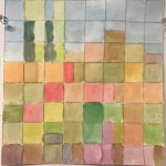
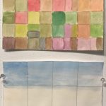
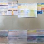
What did we cover in theory this week? This week we covered a lot of color theory and the theory that the practice of turning things upside down or changing our perspective can help us keep a strong foundation as artist. like reducing a landscape to just blocks of color and the relationship of those colors gives new meaning and life the landscape and it also keeps us from stagnating as artist.
What were the readings, video, podcast, art lecture? this weeks readings were PDFs: Thek, Bois, Anderson, Cocker,Kandinsky
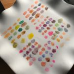
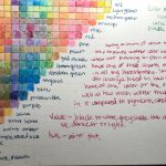
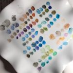
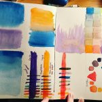
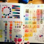
What did we cover in practice this week? We covered how to use watercolors, how to make color mixes, wheels, and general color charts, how to draw what we hear and see, how to break down objects and landscapes into color, and how to talk about art.
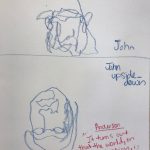
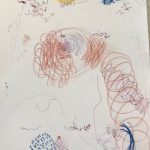
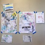
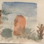
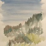
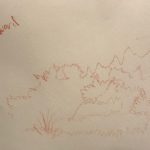
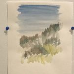
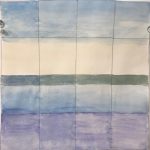
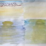
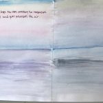
What did we do in studio workshop and for homework? We were out in the field this week at Fort Worden so the only homework was the readings and the rest was in field studio work. We worked with one other person to draw a right side up and a upside down blind contour portrait of each other to help wake up our brains and challenge the senses. We worked on finding landscapes and drawing blindly and then finding the unexpected when we turned around to a new landscape with our three intentional and unexpected blind contour paintings. We worked as a group to create a comprehensive sound map of a area by drawing what we heard and making markings based on those sounds. We also painted color blocks of the sunrise and sunset of the sky and sea at Fort Worden, and two color block paintings of different landscapes around the Fort.
Give a couple of examples of how they inform each other? The readings about blind contour and how it helps stagnating artist find their craft again really helped me keep a open mind about blind contour. The other reading helped me think about the way I mix colors and the constant searching for meaning and how it can help inform a viewer of my art by using certain colors to represent the temperature and feeling of a setting.
List and define in your own words,5 important terms/concepts you learned this week.
Contrast-juxtaposition, being in stark difference from the thing it’s next to
value- lightness or darkness of a color when used with contrast the contrasting value might mean that the colors are very different like a white next to a black or a yellow next to a purple. when used with a gradient value it suggests mass and weight and shape of a object.
gradient- a gradient in paint is like a very dark blue all the way to the lightest blue with mostly white in it, or from black all the way through the darker to lighter tones of grey to white. usually used in a sky line or to shade a object.
texture- the texture of something could be the paint is very think or very thin, or you can see brush strokes, or paper towel from dabbing up paint. you can even have it in watercolors where the paper got scratched and the paint pooled in that groove.
blooms- a bloom is a wet on wet watercolor technique. your page is wet and you get a lot of wet pigment and put it into that wet area and it blooms outwards like a flower opening. if you have a puddle this is why when the are dries you get the darker paint ring around the edges, because the pigment travels as far as it can.
What was new and exciting? painting landscape was new and exciting for me. I rarely paint outside and even more rare is when I would paint a landscape. It was a lot of fun to get out of my comfort zone.
Where did you put your best effort? What did you do that you feel good about? It could be a drawing or time management or participated in class discussion, etc. I really feel like my color mixes for the two color blocking assignments was a lot of effort and time and I feel really good about the representation I got from those colors.
What do you need to work of for next week? Where do you need to focus your efforts? It could be getting reading done ahead of time, allowing for more time for studio homework, arriving to class on time, etc. I’m looking forward to getting all the readings done way ahead of time and having more time to do that and take notes on my thoughts and quotes from the readings. I’m also really looking forward to getting into the studio and practicing with oil paints, a medium I’ve never used.
What you want to get out of next week? I wanted to get all the work done and work in my sketchbook more.