Certificate: Photoshop CC 2017 Design
Citation:
Illustrated Journal Notes: Crystals and Gems in Colored Pencil
Certificate: Photoshop CC 2017 Basics
Citation:
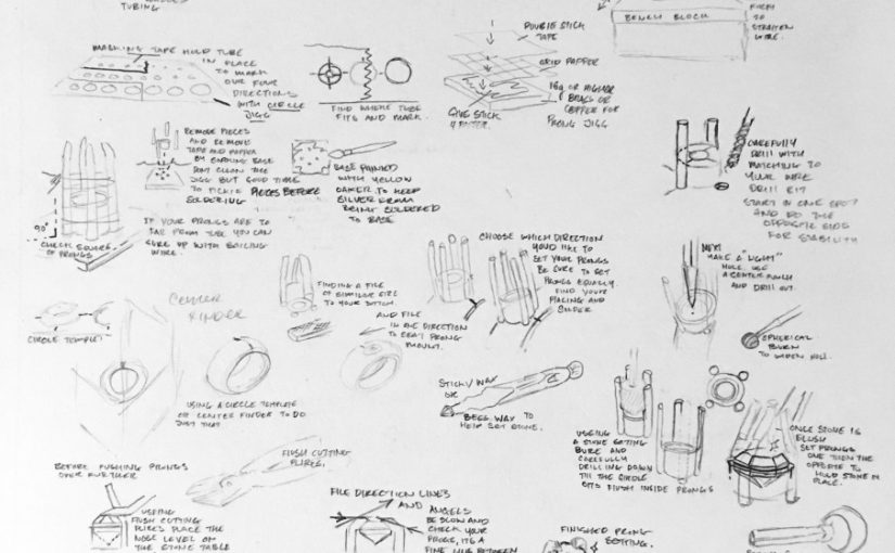
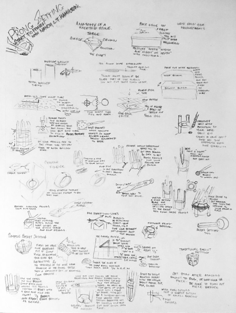
Illustrated Journal Notes: Prong Settings Class
Certificate: GIMP Essential Training
Citation:
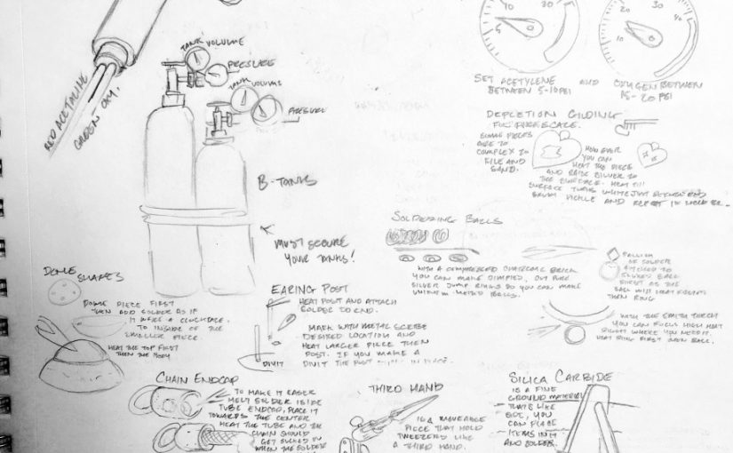
Illustrated Journal Notes: Solder Smarter Class
Notes Taken During: Graphic Design Basics
Some basic elements of graphic design are:
symmetry: symetrical designs can vary in size and color, typography can still be engaging, is a strong choice despite the fact that symmetrical designs are traditional. Asymmetry is also possible in graphic design, it features designs that are balanced but irregular on opposing sides. It keeps the eyes intrigued, “energizes the page”. Either type of design should have movement and tension.
Scale: scale of objects or typography is relative to its context. It can surprise and create intrigue in the viewer if the scale is unexpeced. It can convey distance, differences, a message when contrasted…how do the elements of the page relate?
Framing: how do you direct the viewers eye using margins and borders? You can use a margin, bleed, partial bleed, or cropping. Cropping particularly can add intensity, drama, or change the way the viewer experiences the object – it could feel up close and personal or distant and mysterious. All framing tries to direct the viewer to concentrate on whats most important in the piece.
Visual hierarchy: this distinction of certain words or phrases by visual cues gives order to information. You establish the hierarchy in importance in phrases or words can be done by contrasting height and color, alignment, line space, indents, roman numerals or italics, horizontal or vertical, tone (shade of gray).
Citation:
Summary of Business Planning for Creatives & WordPress Academy
WordPress Academy:
This class was very in-depth, I’d say the first few hours were relevant for my purposes but the later half was fairly advanced. It went over setup, dashboard, main menu, media library, templates and themes, setting up layout, submenus, text and dashboard options for posts, roles and capabilities, customizing profile options, adding videos and audio, controlling comments, adding users, adding pages, adding menus, using a logo, setting headers, using widgets and plugins, and then a lot of aspects using eCommerce, PHP and theme development, as well as using MAMP and other photo and theme websites for your wordpress.
Business Planning for Creatives: Write Your Business Plan
A business plan helps you define your business as well as your own goals, as well as secure a loan from a bank or investors. To make one, you start with answering some questions, like why does your business exist, what makes you different, whats your motivation/inspiration? Then, what your selling, figure out what your popular products or services are, what are the key things you will offer. You’ll need to figure out who your target market is (who are you trying to sell to in terms of age/budget/location/interests), how you will market on social media, through advertisements in magazines or online, promotional marketing? And what tags will you use on social media, when do you want to post and what kind of content? You’ll need to wrap up your business plan layout with some research and numbers – competitor research (how do you stand out, techniques similar companies use and what you can learn from that) and finances (initial costs of starting including materials and time, then ideal projections of your earnings in the short and long term).
Citation:
Brown, Faye. “Business Planning for Creatives: Write Your Business Plan and Elevator Pitch.” Skillshare. Skillshare, n.d. Web. 23 Apr. 2017. <https://www.skillshare.com/classes/Business-Planning-for-Creatives-Write-Your-Business-Plan-and-Elevator-Pitch/1141868303>.
“WordPress Academy: Master WordPress Step by Step.” Skillshare. Skillshare, n.d. Web. 15 Apr. 2017. <https://www.skillshare.com/classes/WordPress-Academy-Master-WordPress-step-by-step/175609084>.
Notes Taken During: Personal Branding Essentials: Making The Most of Squarespace
The benefits of having a website through Squarespace are that you can build a website, have an online portfolio, sell products, without needing to know programming. It’s good for craft makers, artists, and small business owners and only takes 1-20 hours to set up (depending on the complexity). A good page is one that has a strong sense of brand, content thats updated often, and a nice design. Having a website in general is a great way to present yourself/your brand as it adds professionalism, helps keep customers up to date, and is something you can show to people on your phone when networking in person (especially if it is mobile friendly). You can make it a simple one page digital business card or complex. You want to have high quality photos and even behind-the-scenes videos. You can choose a theme that focuses on images, text, commerce, or a single page. Generally you have a few pages that you should have on your website. These are
About Me Page, where you have a summary of you/your company, important facts, imagery that gives a strong sense of you, your products, your space, a personal touch, kept simple!
Home Page: This is the first impression, where you have the best content because its imporant to draw people in on their first visit. You have a headline and description of what your website is representing. It’s clean, easy to navigate, has a logo.
Product Page: Show what you are offering through a gallery of high resolution phototographs with strong lighting, from various views and angles (multiple photos for each product!) Have your custom options and pricing clear.
Contact Page: Hours, map, email, phone number, address, all that someone would need to find you.
Latest Updates Page: Where you would have a blog, updates, stories, a calendar, events, your instagram or facebook feed, etc.
And finally you go through the site and make sure it is usable, easy to figure out, links work, and the menus arent confusing or overcrowded.
Citation:


