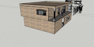
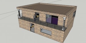
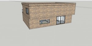
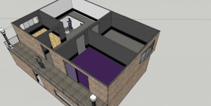
Starting off of the programs project, on the first Tuesday meeting the class discussed each others projects and received feedback and or ideas that can further the project. On Tuesday of week to we had our first critique of the quarter, and I think went by smooth for everyone including myself. For week one’s design I decided to model a basic design in SketchUp with the concept of better airflow inside the home.
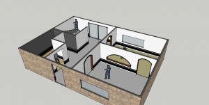
Pretty Simple design? It is still unfinished I have to install some more windows and the doors and record the dimensions.
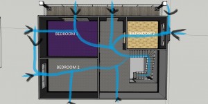
Rooms: Two rooms that sit side to side one with a sliding door (226.1798 Feet ²) and one with a curved pan window (222.9826 Feet ²)
Bath: First floor of the home let of the entrance a 117.4019 Feet ² bathroom containing laundry machines and one on the second floor also with a curved pan window with 118.5636 Feet ²
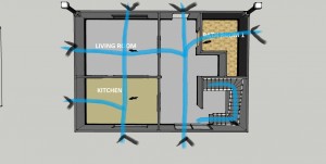
Kitchen: 229.454 Feet ²
Living Room: 274.9566 Feet ²
These first two images are of the second floor, the next two are the first first floor. The blue lines on a bird’s perspective are to show the air circulation through the home. I’m aware that its missing windows, those areas that are missing windows are locations or location ideas of a window. For being the first assignment I think my presentation went 5/10, and after the critique I decided to let my designs evolve from feedback and the weeks lessons.
I’ve really loved getting to see your weekly presentations. They’ve all been really really good and really interesting. You really have an eye for architecture. Good job! Can’t wait to see the final!