Filed under:
Week Nine 6/4/2013
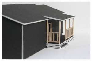
I feel as if this quarter just began and it’s already coming to an end. This was my last week of work and I am nearly finished with my balsa wood model. It’s been an interesting project and I’m feeling excited about it being a final representation of the work I’ve done this quarter.
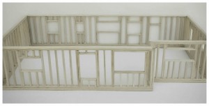
The process for constructing this model has been a complicated one. While working with foam core I was able to focus more on scale and presentation rather than proper construction and correct angles. Balsa wood has less room for error and requires more time and attention than other materials I’ve worked with thus far. During the construction process I found myself heavily relying on Francis D.K. Ching’s Building Construction Illustrated to guide me through proper framing techniques. I also sought out various online articles and videos that explained exterior wall framing. Working only with the framework of the home allowed me to study and recreate the structural essence of a space rather than focusing solely on aesthetics. I also gained a more in-depth understanding of the construction process. While I would have enjoyed creating a more complete interior framework, financial constraints prevented me from doing so.
I was reminded of my reading during the construction process, specifically the Deconstructivist art movement in the late 1980’s. This movement explored art and architecture through linguistic philosophy and the semiotic theory of “Deconstruction”. I realized that I was constructing the familiar shape of a home by assembling small individual pieces of balsa wood. The project as a whole relies mainly on geometric shapes and 90 degree angles to make an object that we universally identify as “home”. This seems to be the opposite of deconstructivism. I began to think about how I could make something completely different than my home using the same pieces used to construct it. While I didn’t develop any immediate ideas I did discover a different way of perceiving structural framework that is new to myself. I wondered how many different kinds of spaces could be constructed using the same pieces I used to build my model. I feel like we tend to perceive homes in a way that pre-assembles them in our minds. We have preconceived notions about the potential interactions and future activities that can be held there without acknowledging the potential that they could be something entirely different. Designing a space that stands on it’s own seems to be what deconstructivism is about. A space that defies the modernist notion that form follows function.
Week Eight 5/27/2013
In preparation for the end of the quarter, I began constructing my detailed balsa wood model this week. I also finished Mo Zell’s Architectural Drawing Course: Tools and Techniques for 2D and 3D Representation which I will elaborate on at the end of this post. The balsa wood model is a 3/8 scale representation of the framework of my house. I chose to make another model of my home for two reasons. The first reason being that we are potentially buying the house and I am interested in adding a room to the existing structure. The second being that it is a familiar space I can take my time measuring in an effort to fully understand working with different scales.
As this is my first time constructing a model entirely out of balsa wood, I’m realizing how time intensive it is to work with. You are literally framing a home on a smaller scale. In order to ensure that all details are accurate, I have been referring to Francis D.K. Ching’s Building Construction Illustrated for proper framing techniques and measurements. The planning process was relatively simple as I had previously drafted a floor plan when making the foam core model. The only addition I had to make was adding all of the windows on the home. The real challenge has been finding a proper technique for cutting, sanding, and gluing each piece. At first glance I assumed the process would be simple then quickly realized that even the tiniest mistakes can ruin an hours work. In the absence of owning the necessary tools, I have been cutting each piece with a box cutter, ensuring pieces are square with a speed square, and gluing them with hot glue. As I lack access to any sort of woodworking clamps I have been using hot glue as an alternative to wood glue. This makes for a bit of a mess but I’m sure I will be able to clean up the model when it is finished. So far I have the north and south side of the model constructed. I will continue to work on this next week to meet my due date of 6/6/2013.
The last chapter in Mo Zell’s Architectural Drawing Course: Tools and Techniques for 2D and 3D Representation is titled “Accessing the Profession”. This chapter provides information on pursuing architecture as a career. As this is something I’m currently planning on and attempting to focus my undergraduate education around, I found this chapter to be very helpful. A main goal I’m currently focusing on is compiling a portfolio for a graduate or potentially undergraduate architectural program. This chapter mentions focusing on organization and showing a specific style or strength in your portfolio. Although I’m just begging my undergraduate education, I feel that some of the design work I have done thus far could be considered for adding to my portfolio. I don’t feel like I have a particular style yet but I see influence coming into my work. I think we all have a personal style in the work we create and I’m excited to see what it may be for me.
Week Seven 5/20/2013
This week I faced my most difficult project yet. Working from Mo Zell’s Architectural Drawing Course: Tools and Techniques for 2D and 3D Representation, I was assigned the task of designing and constructing a three dimensional representation of a space for a traveler. The requirements for the space were as follows:
- Overall area is limited to 240 sq. feet.
- The smallest room dimension is 6 x 40 ft
- Entry must always occur along the shorter wall
- Ceiling height must be no taller than 12 ft and may not be modified to less than 6 ft 8 in.
- Traveler must use the room for bathing, changing clothes, work, and relaxation.
- It should include a dressing area with space for hanging clothes, a place to wash, a place for bathing, a steam room or sauna, a toilet, a TV, a radio, a coffee maker, a place for magazines, a space for writing, and a place to rest.
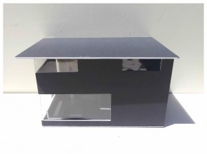
Using this prompt, I decided to make the dimensions of the space 20 x 12 ft with a 12 ft ceiling. Incorporating research of the utilization of small spaces as well aspects of small post-war expansion dwellings from Mark Gelernter’s book, A History of American Architecture: Buildings in Their Cultural and Technological Context, I began designing a floor plan. I wanted to make the space comfortable as well as usable despite the small size. My first vision was to design a space that was compact and and therefore included everything one might need to be comfortable. Thinking about this more and recalling readings about nostalgia and technology in the home, I came to the conclusion that the most comforting space is one that is familiar, even if you haven’t been there before. Making use of a loft area and hanging features, I was able to create a space that felt much like a bedroom. In the spirit of modernism, I chose to incorporate large windows in an effort to open the space.
Using a ¾ scale, I created a model using a combination of foam core, balsa wood, and plastic sheets. As I constructed my model, I found my thoughts wandering and began to think about the ways in which new spaces can comfort us and seem familiar. It seems to me that a large reason why classical architecture and post-colonial architecture has been prevalent for so many years is due to this comfort. Continuing a style and merely adding or subtracting from it protects the core of the style. As that style in continuously repeated it shapes our environment and imaginations. It seems to me that this idea must be kept in mind when designing spaces for people in transit. With this, individuals are able to relax and and use the space as it is intended.
Weeks Five & Six 5/14/2013
I found myself obsessing over minimalist art and perspective this week. While working through Mo Zell’s Architectural Drawing Course: Tools and Techniques for 2D and 3D Representation I decided to do a study of 2-point perspective and see where it took me. It was a very interesting process as I began thinking of ways to best render my ideas.
I chose to work mainly with 2-point perspective for this project as I feel it is the foundation for architectural drawings. Frank Lloyd Wright used 2-point perspective in many of his renderings in a way that showed the beauty of the structure in the environment that it was apart of. His structures are uniquely displayed in a way that is simultaneously separate from and apart of the environment. For me, this creates the feeling that each building has always been there and belongs there. Drawing inspiration from this style, I chose to focus on the perspective from which he renders each space. This seems like a key factor in the effectiveness of Wright’s renderings. This technique seems to be clearly displayed in his rendering of the Fallingwater house (below).
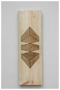
I wanted to experiment with a different form of rendering than I had with previous projects. I chose to simplify my work in the spirit of minimalism and focus on a series of 2-point perspective boxes in different positions, all with the same horizon line. Taking inspiration from technical drawings, specifically exploded axonometric drawings, I designed a series of three boxes layered on top of one another. I wanted to accent the interior of the each box and did so by filling it with wood stain. I debated whether to use white or black acrylic for the line work of the boxes, eventually settling on black as I felt like it was most effective at calling attention to the lines.
This project gave me deeper insight into using perspective in a way that is not only realistic but emotionally engaging and artistic. As I previously stated, there is something different about the way Frank Lloyd Wright portrays his buildings. Narrowing it down to the perspective from which he draws from may seem simplistic but I feel it is truly what distinguishes his work from others. Exploring rendering strategies has cause me to begin thinking of ways I can develop my own stylistic approach to rendering in a way that is both artistic and effective.
Museum Visit 5/7/2013
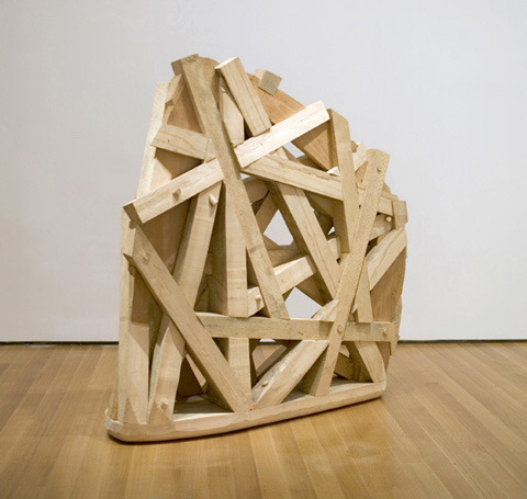
This last Tuesday I had the pleasure of visiting the Seattle Art Museum as well as the Seattle Architecture Foundation. I didn’t have the chance to look at what exhibits were currently on display at the SAM before hand and was pleasantly surprised when I arrived. I’ve been drawing a lot of inspiration from the minimalist art movement lately and there just so happened to be fifty works from the Herbert and Dorothy Vogel collection on display. To say it was a treat to see would be an understatement. Essentially every minimalist artist I had been studying had work on display, including two pieces by Sol Lewitt. As I studied the works I ran across many that really stood out. I was viewing most of the work through an architectural lens and found this piece below by Martin Puryear to really speak to what I have been focusing my own architectural work on lately.
It’s hard to include everything I found interesting in one post. A trip to the museum can be a very overwhelming experience. There is simply not enough time in one trip to pay proper attention to all of the works. I found myself coming back to pieces later in the day to further study them.
After leaving the SAM I traveled to the Seattle Architecture Foundation on 5th Ave to view their permanent blueprint and model exhibit. The exhibit seemed to include every piece of Seattle Architecture they could get their hands on. I was most interested in the models they had on display, specifically the Benaroya Hall model. I was drawn to this due to it’s complexity and how exactly it portrayed the real Benaroya Hall. Most of my visit was spent focusing on design aesthetics as well as speculating on the way small details were executed within the model construction process.
It was a day full on inspiration and I brought home many ideas to think about. I see this trip being very influential in my upcoming works as I feel the need to explore the pieces and designs that I’m still processing.
Model Building 4/27/2013
This week I deviated a bit from Mo Zell’s Architectural Drawing Course: Tools and Techniques for 2D and 3D Representation due to the cost required to complete the project. Instead, I focused my efforts on a very practical project based around foam core model building. Using foam core, I completed a 3/8 scale model of my house. I chose this project because I felt it would be an entry level introduction into a skill set I would be using more in the future.
Architectural models have always fascinated me. I believe model building to be the most comprehensive form of representation as it is merely a smaller scale version of the finished project. Models are such an important aspect of architecture that I want to build a skill set for making them early on. While models can be as complicated as one chooses, I chose to include minimal details while putting my focus into the overall shape and proportions of the house. I used the floor plan I made the previous week and took measurements of the roof and exterior wall. I drew a diagram of the four exterior sections of the home and wrote in all measurements for reference.
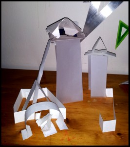
Working with foam core at the beginning of this quarter proved to be difficult. My cuts were jagged and I simply had no developed technique for gluing. I soon realized that the key to making foam core models was to use a very sharp blade and cut in one swift motion. Once I understood this I was able to apply the same technique to gluing and was pleased with the first corners I joined. As I finished my model, I decided to construct and abstract shape. I’ve been interested in the motion of crushing and turning lately and wanted to incorporate this into my shaped. I drew a few ideas that revolved around triangles and decided to construct one out of foam core.
I’ve been very inspired by minimalist architecture and art lately and wanted to incorporate that into my model and shape. Minimalist art has really resonated with me this quarter, specifically the work of Sol Lewitt.  I was introduced to his art Fall quarter and realized similarities between his work and my own. As this project progresses I’ve found it to be taking on somewhat of a fine arts aspect as well. I find that architecture speaks to me as a form of artistic expression and is, on it’s own, a form of utilitarian art. I look forward to exploring this more in the future as I work towards building a basic drafting skill set.
I’ve been adding projects to the “Works” section of this site. Click on “Works” in the side bar to view images of projects from this week as well as projects from previous weeks.
Summer Project 4/26/2013
I received a phone call today from a friend who said he was interested in building a tiny house. He is purchasing a flatbed trailer and asked if I would be interested in designing a tiny house for him this summer. I told him that I would love to work on a design for him. I asked him what he was thinking in terms of the aesthetic of the home and he stated that he wants it to be like something out of The Jetsons. I started to do some research and came across a company based out of Germany called Baumraum. While their designs are more organic than futuristic, they incorporate a similar aesthetic into the interior of the home. I’m excited to explore futurist architecture and start brainstorming designs and materials for this project.
Here is the Baumraum website as well as some of their designs.


Orthographic Projection 4/21/2013
Orthographic projection (or orthogonal projection) is a means of representing a three-dimensional object in two dimensions. It is a form of parallel projection, where all the projection lines are orthogonal to the projection plane, resulting in every plane of the scene appearing in affine transformation on the viewing surface”
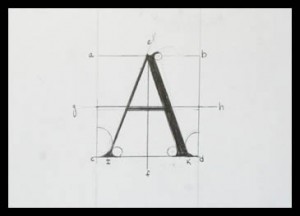
This week I focused on orthographic projection. Using Mo Zell’s Architectural Drawing Course: Tools and Techniques for 2D and 3D Representation I created a variety of orthographic projections of manufactured environments. During this work, I was assigned the task of drafting a letter from Albrecht Dürer’s Of the Just Shaping of Letters.
Drafting a Dürer letter further solidified connection I had made the previous week studying the work of Buckminster Fuller. There is a long relationship between architecture and geometrical proportions. In earlier readings of Mark Gelernter’s A History of American Architecture, I was introduced to the history of perfect geometrical proportions in architecture. Ancient Greeks first started using precise geometry in architecture in an effort to represent the perfection of the gods. This idea carried on for thousands of years and I believe has influenced our current perception of space. Mathematics plays such an enormous role in our understanding of the universe that it is undoubtedly a key factor in architectural design. I speculate that subconsciously we are constantly assessing and making mathematical connections in the spaces we inhabit in an effort to decide whether or not we feel comfortable. These connections offer predictability and comfort in space.
While working on orthographic projection, I felt the desire to start planning for my detailed balsa wood model. I decided to measure the interior and exterior of my home and wrote the dimensions down on a rough floor plan. I drafted a proper floor plan using a ¼ scale and was pleased with the final draft. It was interesting to see a representation of the home I’ve lived in for 4 years. It is such a familiar space that I found creating a floor plan to be incredibly natural. I’ve been trying to be very conscious of the spaces I am so I can observe the architecture and overall feeling of the space. It’s interesting to think about what we base our standards on in regards to spaces. I use my own home as well as my childhood home as a baseline. These are the spaces that have most influenced my emotional growth. I’m interested in exploring and reflecting on the feelings that other spaces bring up as I inhabit them during this next week. I’d like to better understand these emotional reactions so I can account for them in my future designs.
Dürer “A”
Reflecting on Weeks One & Two 4/14/2013
Reading Mark Gelernter’s A History of American Architecture has made me think about the context from which we derive architectural design and ideas. These first two weeks have been almost entirely devoted to improving sketching skills and researching architects as well as architectural periods. The bulk of my research has been focused on ancient civilizations, the American modernist movement, and the minimalist architecture movement.
Architecture has a rich and deep history that is consistently represented in every building designed. Reading about ancient civilizations and the architecture they developed based purely on necessity and available resources fascinated me. It also forced me to wonder about current designs that are derived from these same styles. One conclusion I drew was that the use of the geodesic dome in green building seems fairly derived from early Winnebago Wigwam construction. While different in ways, they seem to have the same basic principles behind them. The framework of both of these structures relies heavily on geometry which makes the dome construction possible.
Finding inspiration has been an interesting task. I felt as if I wasn’t accomplishing much at the beginning of this week and later realized that I had been doing research but felt like it was procrastination. I took this to as a representation of my interest in architecture. Throughout my research I discovered minimalist architecture. This style appeals to me due to its simplicity. I was reminded of something I had recently read in A History of American Architecture. Gelernter references the Neolithic Turkish settlement of Çatalhöyük and states that no home stands out from one another, implying that there was no central political authority. Minimalist architecture seems to echo this in its simplicity and, be it consciously or subconsciously, attempts to diminish hierarchies with domestic space. This view of domestic collectivity appeals to me and I plan on exploring this further.
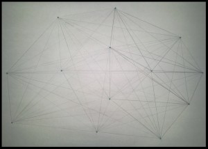
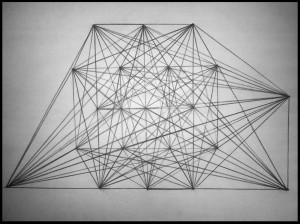
I came across Buckminster Fuller during my research and was reacquainted with him and his geodesic dome. 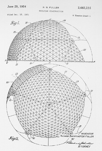 While completing a line study assignment from Mo Zell’s Architectural Drawing Course: Tools and Techniques for 2D and 3D Representation, I started to connect similarities between the triangular repetition of my own drawing and Fuller’s dome. As I understand it, the principle behind the geodesic dome is the use of the triangle. A triangle is stronger than a rectangle with applied pressure because all points are fixed and connected to another point. It is therefore able to keep it’s shape under heavy weight whereas a rectangle will fold. Exploring more of the geometry and physics involved in architecture will lend me a better language for which to talk about it in the future. As for now, these are merely my interpretations of the concepts.
Sketching 4/12/2013
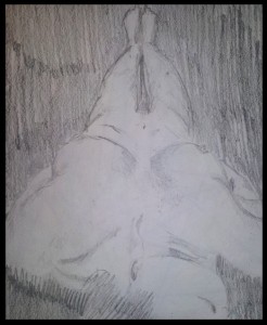
These past two weeks have been spent sketching, looking for inspiration, and understanding the historical context in which American architecture takes place.
Line Study #1
Line Study #2
Abstract Paper Construction
Unusual Perspectives Sketch (landscape study)
Inspiration 4/10/2013
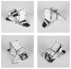
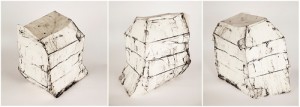
This week I’ve been looking everywhere for inspiration. I’ll be posting more on that later in the week but I thought I would share some work I’ve been drawing from. I hopped over to poorthingpress.tumblr.com to check out my friend Drew Miller’s work. He’s been doing some collagraph sculptures lately that are amazing. I’m really inspired by the complexity in such basic shapes.
Pack, Collagraph, Paper, 4” x 6” x 4.5”
Twin, collagraph, paper, 16” x 14” x 12”
26 Comments so far
Leave a comment
Line and paragraph breaks automatic, e-mail address never displayed, HTML allowed:
<a href="" title=""> <abbr title=""> <acronym title=""> <b> <blockquote cite=""> <cite> <code> <del datetime=""> <em> <i> <q cite=""> <s> <strike> <strong>


I appreciate the focused reference to “inspiration” that frames your entries. Looking for and finding inspiration is surely a mark of artistic endeavors. Keeping track of what and what does not inspire your work is worthy of attention. The mention of Buckminster Fuller’s signature geodesic dome work in our first critique pops up in your entry in a concentrated fashion. The history of his inspiration for the geodesic dome is surely complex in regard to geometric and cultural elements. There are visual and construction elements to consider, but also the reality of attempting to live in a dome as a domestic space. We don’t see many dome homes and there are reasons for this. I’m thinking of Frank Lloyd Wright’s signature Unsonian construction that is evident in so many house designs past and present. Are humans more drawn to rectangles than triangles? BUT, how useful to recognize from Fuller’s work that a triangle is stronger than a rectangle
I think it’s really great how much you’re really getting into this project and the time you’re taking to focus on all your work! Can’t wait to see the final.