Media update!
I have linked my instagram to my e-journal. Now all of my photos of my print work and pottery can be seen in my image gallery.
Trading Cards and Printmaking
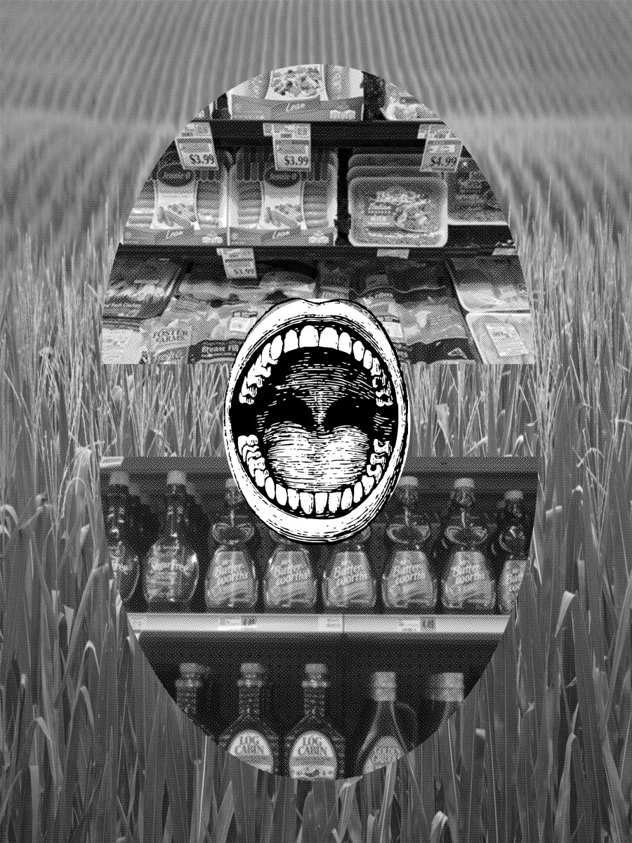
Titled: Corn
I designed this image to be a pixelated (small dots to form an image) greyscale, 8×10 print. Unfortunately, because of the scale of the print the imagery did not come out as detailed as it did digitally and I was not able to create a physical print. I want to share the image anyway and lightly explain my thought process and why I chose to collage these images the way I did. I created the design to use my studies in print making to relate to Kyla Wazana Tompkins content on trading cards, in chapter five of her book, Racial Indigestion.
After reading and reflecting on the content in chapter five of the book, Racial Indigestion, I went to my local grocery store and walked around the aisles. I looked for the presence of the modern day “trading card.” The following quote is Tompkin’s description of what a trade card was in the antebellum era, “Trade cards, small rectangular cards meant to be handed out in grocery stores or included in product packaging, were designed by a wide variety of manufacturers, advertising everything from seeds to soap, and were produced by printers in every region of the nation and then carried by “drummers”, or traveling salesmen. Indeed, trade cards were part of a general onslaught in advertising media in the period that also included posters, calendars, pamphlets, and show cards. (pg.149)”. Not only were the trade cards used to advertise, the content was chosen to appeal to customers based off of a cultural consensus reality; at the time there wasn’t the same technology to track and survey consumer behavior. The imagery, then, spoke for itself the presence of racial hierarchy, discrimination, sexism, gender roles, violence, illusionary imagery to evoke jealousy for the “perfect life”, and the desires and needs of the consensus reality of the time.
(An example of a trading card for Rising Sun Stove Polish, labeled, “The Happy Home”)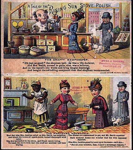
When I walked around the store what first drew my eye was the packaging and marketing for meat; large bold lettering saying tender breast, spicy sausage, lean, fresh all natural, less fat, and special. The packaging was clear; the flesh in “clean” uniform cuts, some with skin, some completely naked. The descriptions and appearance created a cognitive dissonance in my mind. On the one hand, the descriptions and presentation was familiar and could be paired with meaning that was normal, and almost made the meat appealing. Although, looking through the lens I was beginning to build by reading Tompkins, the words and presentation brought up the thoughts and feelings that are paired with a person sitting too close at a bar, trying to engaging me in small talk, all the while slipping in an innuendo here or there; It felt dirty and exposed.
The commodity in front of me was packaged meat, all I could see is corn. Since corn (mostly genetically modified (GMO) and genetically engineered (GE) is a subsidized crop in the United States, it is a cheap source of food for livestock. The carbon that is a part of the backbone of our DNA comes from the carbon we consume; for many people living in the United States that source is corn. They may not know it because it is disguised as meat. It is also disguised as sugar, which, leads me to the next aisle I walked down.
When I walked down the aisle that contained the baked goods, sweeteners, etc., my eye stopped at the female shaped bottle labeled, Butterworths.

My first thought was, “The female body is literally being used as a container to house the promise of sweetness and the tangible commodity; which is the mahogany syrup made almost purely of corn. Her hands are folded protectively in front of her body which, exudes a stance of service and passivity. This stance in body language studies can show that the person feels vulnerable, practicing self restraint, anxiety, or frustration. This woman also looks like a woman of color due to the hue of the syrup. While reflecting on my observations I thought back to Tompkin’s writing about trading cards, “Produced at the end of the nineteenth century, these images illuminate the connections between spectatorship, desire, and racial embodiment as they were imagined in the period by printers and advertisers, who desire to transcend the two-dimensionality of the image and to reach into the spectator’s body is encoded in these images, with the purpose of awakening either the appetite or at least some surplus amount of attention. (pg.163)”
The Butterworths advertisement isn’t two-dimensional, like a label or in the past a trading card, it goes a step further and is a three-dimensional figure. Not only is the marketing of Butterworths syrup reaching out to the spectator’s body, it is evoking desire from the spectator’s body by using a container shaped like the female figure; the figure also looks like the body of a female of color. The Butterworths bottle reminded me of another popular syrup, Aunt Jemima. When I looked up aunt Jemima on the internet, old advertisements looked like the example of the trading card.
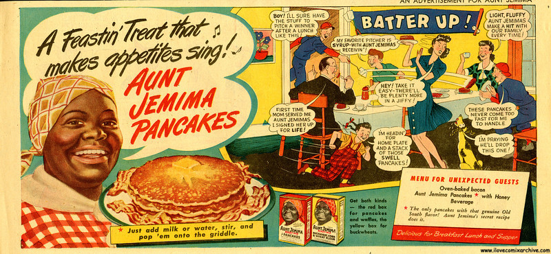
The explicit roles in this advertisement show how common the racial hierarchy was at the time. Aunt Jemima is dressed in work clothes and is clearly in a service role, while an all white family sits down to eat without her. She is present however, by providing the sweetness on their pancakes to make their ideal breakfast “perfect”, and their appetites “singing”.
This made me think of another quote, “In this generative moment in advertising, a moment in which advertisers were training the consumers’ attention span, sensual reactions produced a new kind of consumer-one molded on the theater spectator rather than on the utilitarian buyer. (pg.163)”. Were the people who designed the Butterworths bottle designing it because they believe that seeing a bottle in the shape of a woman would catch, and maintain, a consumer’s attention rather than a normal bottle, and label?
I see how the female form could stir feelings of comfort from memories of motherly care. Or sadly it could be a projected sexual desire for the female form; the catch phrase, “Thick and rich!”, remind me of words used to describe women who are sexually appealing in popular culture. These thoughts led me to think of the section in the chapter devoted to the other, and eating the other.
I added the image of the mouth in the center to represent this consuming of the other, the mouth as the center of sexuality, the female genitalia and mouth as a source of power, and consumerism as a whole. The imagery of the mouth was also inspired by Tompkins, “In these cards the mouth becomes a space of interethnic and interracial encounter, part of a symbolic order in which ingestion is metonymic of an active relationship with commodity consumption, politics, and citizenship. To consume and to be consumed gain public political meanings. (pg.163)”.
The interethnic and interracial encounter goes beyond the symbolism into the reality. What I saw was also the exploitation and rape of the corn plant it self. Another connection is the rape and exploitation of the plant is born out of the rape and exploitation of the native people who co-evolved with the plant, honored it, and built livelihoods around it and through it-only to lose it. The corn plant has been hybridized and manipulated far beyond its origins. Though it’s exploitation it has led to vast loss of crop diversity , cultural diversity, and the health of the public. Ironically the health of those most marginalized are affected the most by the standard diet in the United States through genetic dispositions to what is consumed the most, which is, sugar, dairy (another form of corn), and processed grains.
The parallels of the abuse is nauseating, and needs to be looked at; just as the racial discrimination in the trading cards must be acknowledged. the irony of walking through the aisles and seeing the multicolored advertisements with the promise of prosperity, diversity, and health, all looked like corn to me. It also looked like monoculture and the metaphorical monoculture that is white culture. As well as, the karma of the imagery and marketing being used to pacify consumers into feeling abundant and safe while the source of that safety is like an ecological credit card; it is over harvesting and destroying fertility from the soil (mother earth and the archetype of the mother), that is being raped and not replenished, or respected. This over drawing will have to be paid back somehow. Whether it is paid through deteriorating health, climate change, and/ or collapse through the loss of cultural and ecological diversity. No one wins in the long term by staying complacent through escapism imagery. Especially the imagery in the form of marketing being fed to the masses through popular culture, and the companies behind the commodities. They commodify human life to grow, process, and distribute, the commodities, as well as, commodify the minds and bodies of the humans consuming the product. If we stay ignorant to how imagery, story telling, and culture condition the public, we are doomed to be manipulated into roles as consumers instead of citizens, or first and foremost, human beings.
To return to my work in printmaking,
I was able to create another image successfully.
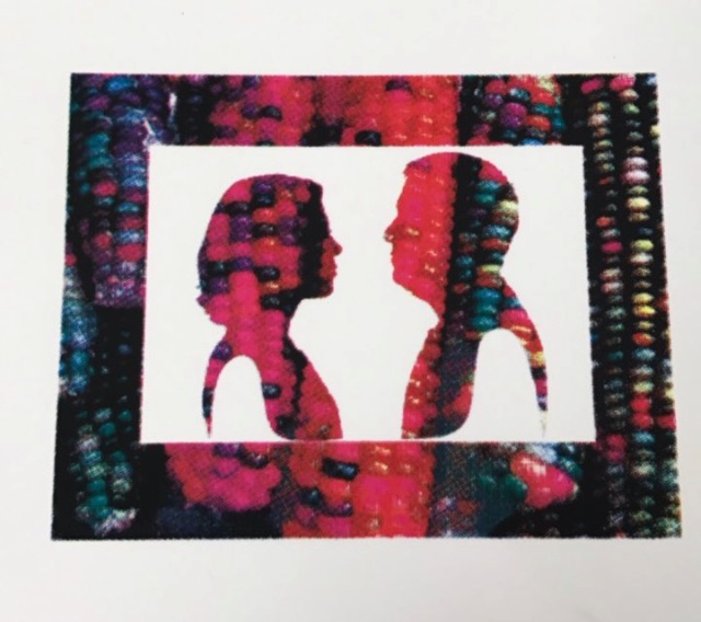
Titled: Carbon Copy.
I have also been working on a print that will represent some of what I have learned through my tea ILC.
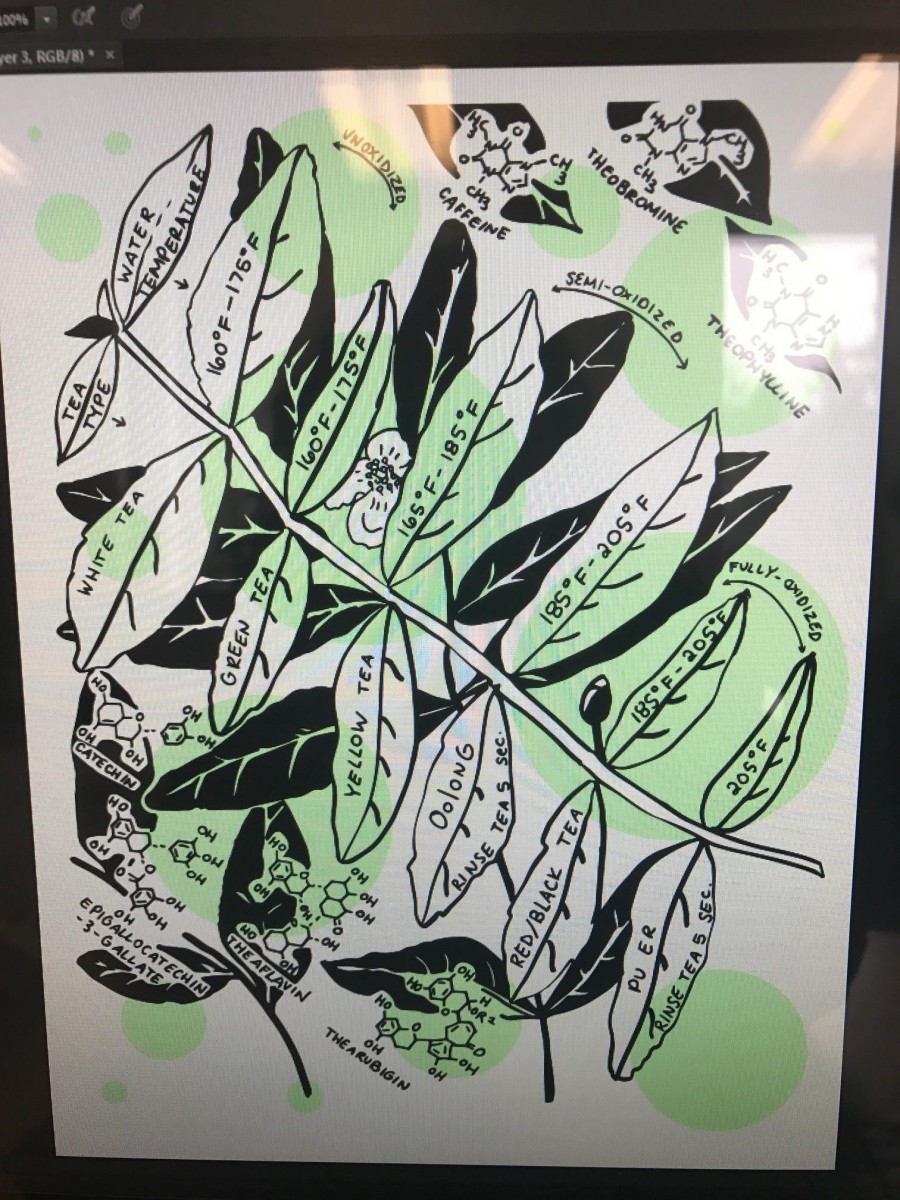
I have drawn out the chemical composition of a catechin, epigallocatechin-3-gallate (source of astringency, bitterness, and antioxidant in tea, especially green tea), theaflavin (polyphenol and source of yellow color in green tea/Oolong), thearubigin (tannin, and source of red/black color in red/black tea and pu er) , caffeine, theobromine, theophylline, the categories of tea (unoxidated, semi-oxidated, and fullyoxidated), as well as the types of tea and the proper range of water temperature which it should be brewed at. I am still in the design process but I will have prints by Tuesday!
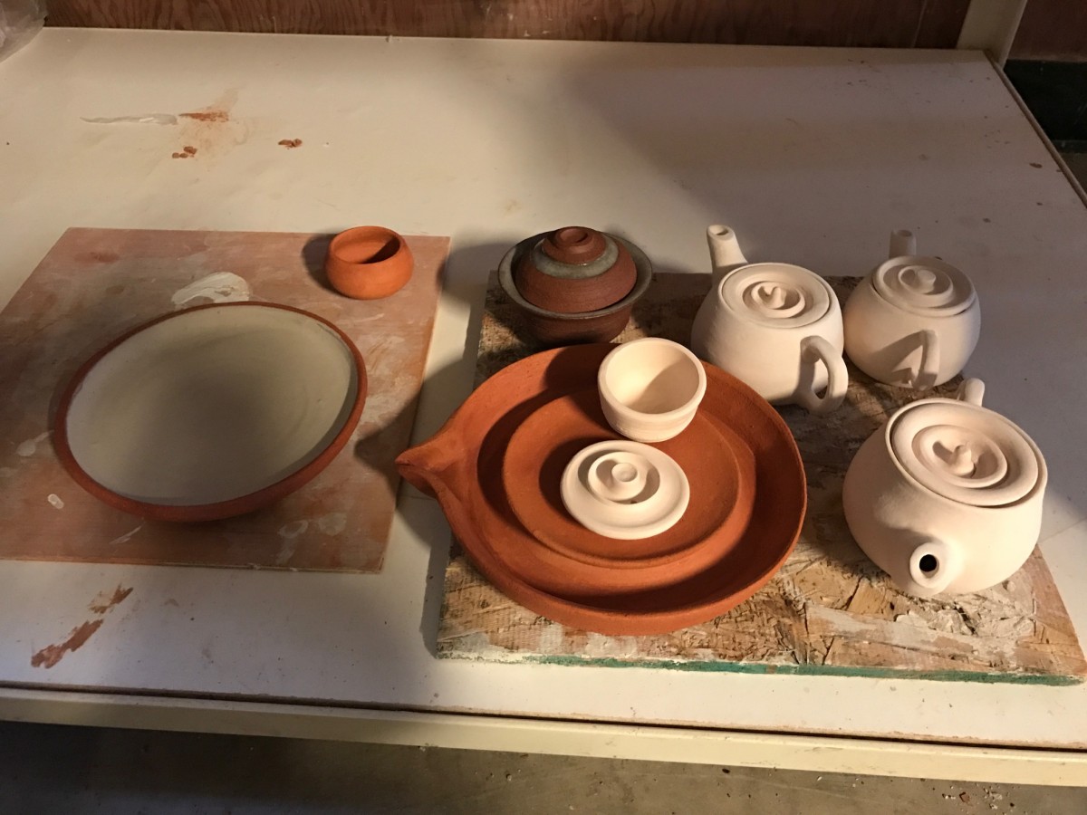
The last of my work is out of the bisque kiln and will be glazed tomorrow! So excited!
Sources
“Aunt-J-1946.jpg (800×370).” Accessed March 13, 2017. https://changeoffaces.files.wordpress.com/2011/10/aunt-j-1946.jpg.
“c_fit,fl_progressive,q_80,w_470.jpg (470×284).” Accessed March 13, 2017. http://images.gawker.com/18s44jotb3cfdjpg/c_fit,fl_progressive,q_80,w_470.jpg.
“Mrs-Butterworths++Mrs+Butterworth%E2%80%99s+deal.png (252×300).” Accessed March 13, 2017. https://2.bp.blogspot.com/-HjTItRyT2WY/VuO3Isdq4DI/AAAAAAAAQEs/WX-PiZXRguoRbSsz7WtY7LbB1xRVuPNRw/s1600/Mrs-Butterworths%2B%2BMrs%2BButterworth%25E2%2580%2599s%2Bdeal.png.
“StoveOutside.jpg (429×482).” Accessed March 13, 2017. http://www.antiquebottles.com/rl/tc/StoveOutside.jpg.
Tompkins, Kyla Wazana. Racial Indigestion: Eating Bodies in the 19th Century. New York University Press, 2012.