Doors. We use them everyday. They are not a very complex tool yet for some reason we can struggle with them. Whenever you struggle to figure out how a door works you typically blame yourself. “This object is so simple I must be an idiot to not know how to use it”. However, doors have amazing cues that tell us how to use them. When these cues are absent we become confused.
Example 1: Push handles
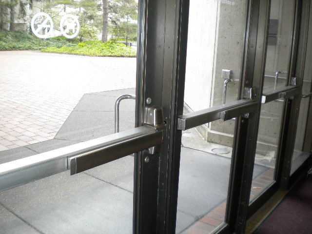
This a well designed push handle door. Just by looking at it you know which side to push on and how it opens. There is no reason for anyone to get confused while using this door.

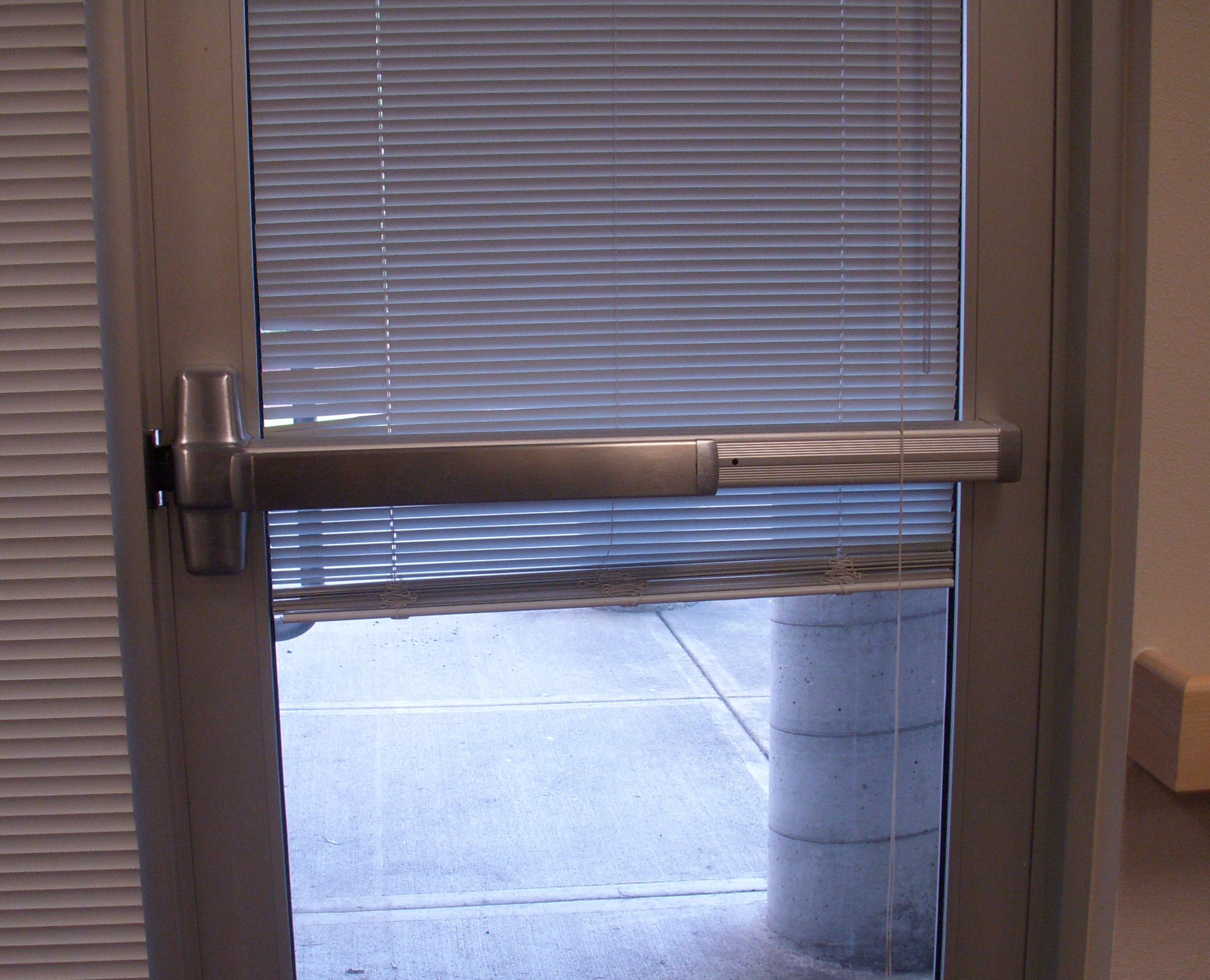
This is a poorly designed push handle. Yes it makes you want to push, yet there is no indication on which side. When I first used this door I pushed on the wrong side.
Example 2: Pull Handles
This is an example of a well designed pull handle. You want to wrap your hand around the handle which makes you want to pull.
Example 3: Poorly designed doors
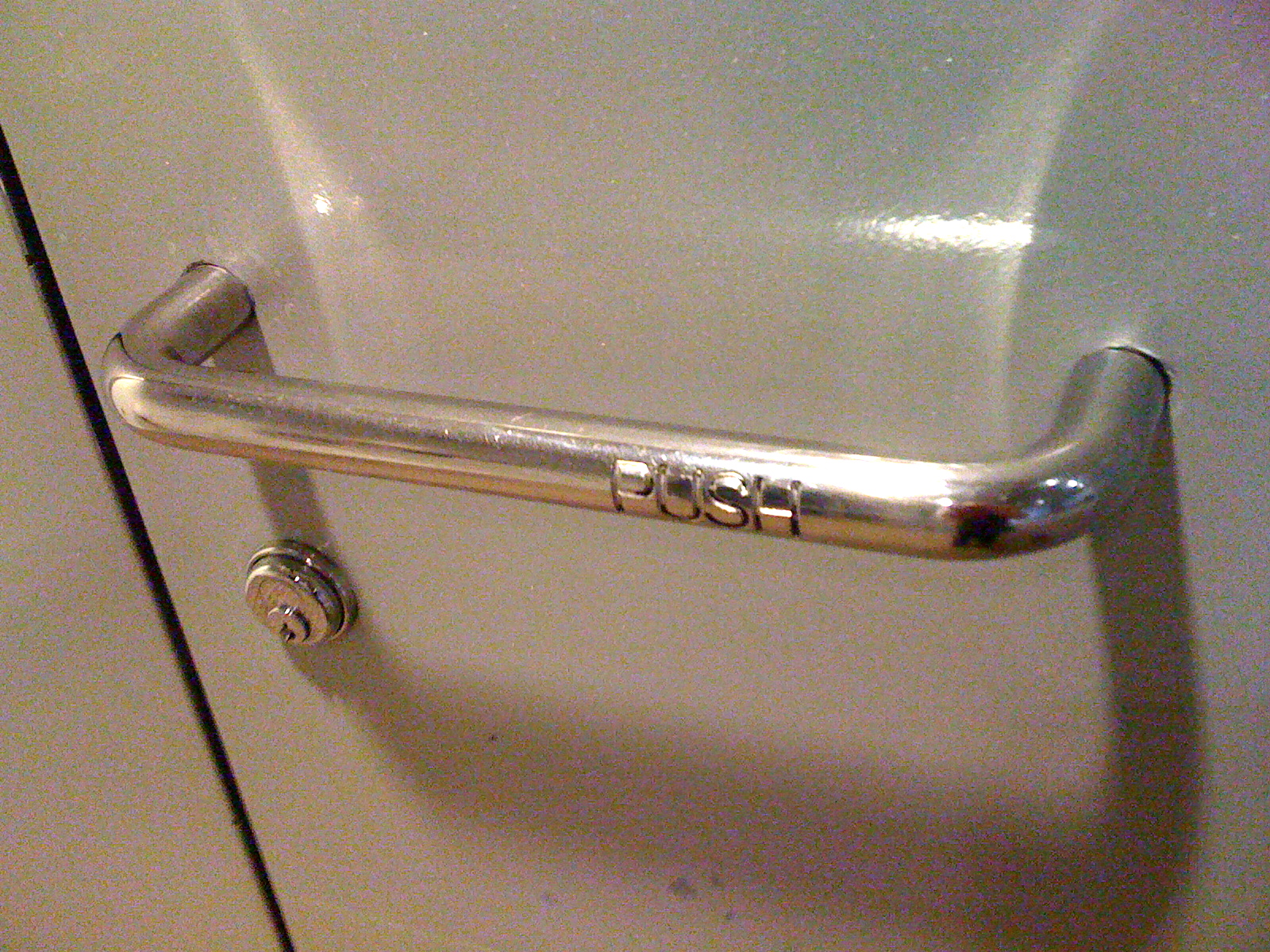
This is a very poorly designed door handle. It is a pull handle that tells you to push. Not only that but the indicitor that tells you to push is difficult to see and read. I can guarantee you that many people have placed their hand over the words ‘push’ and tried to pull the door open.
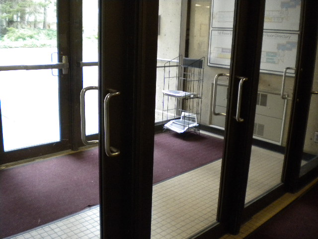
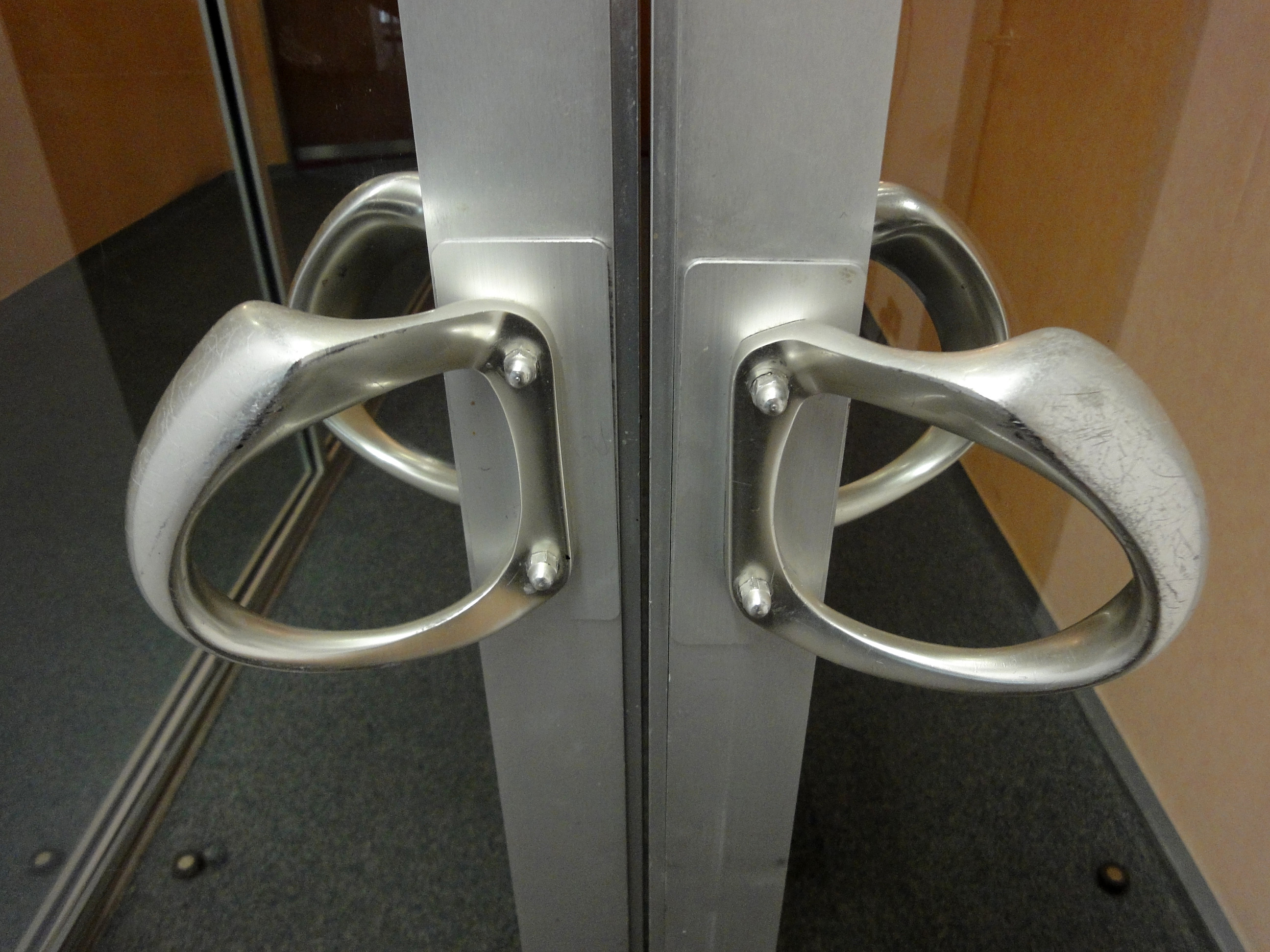
This is another poorly designed door. Both sides have pull handles but we all know that only one side can be pulled. Can you tell which side it is?
The Verdict.
This might be the best door design. You have obvious push and pull handles on each side. There should be no confusion on how this door works.