Tag Archives: Design

Being in a Usability Study

Over the course of the weekend I participated in a usability study for T-Mobile. Although I am not at liberty to discuss the details of the study I can tell you what I learned from it. Usability testing is something that companies will do in order to see what parts of a design work well and what parts don’t. This method of testing is important. However, many companies don’t do it. In fact, T-Mobile doesn’t do it very much itself. It doesn’t even have a usability department, it has to hire outside contractors to get their testing done. The reason most companies don’t do usability testing is because it takes a while to do. You have to find people, schedule appointments and conduct the research. Once research is conducted it takes time to find correlations between information provided. Most of the research done is qualitative not quantitative.  So this can slow down the process as well.


Usability testing is a very important method that should be utilized more often. Although most designers are competent in their method of design it is still important to have your products put through tests to make sure it’s not too difficult to use. This is just another method that designers should consider. If you are not sure how to design for the user, have your products tested. Usability testing is also a good way to learn new things about how people interact with their surroundings. The information that you gather from one test can be used to help design something else. It helps make designing easier and products less complicated for the user.
 

Push Sign on a Pull Door

Doors. We use them everyday. They are not a very complex tool yet for some reason we can struggle with them. Whenever you struggle to figure out how a door works you typically blame yourself. “This object is so simple I must be an idiot to not know how to use it”. However, doors have amazing cues that tell us how to use them. When these cues are absent we become confused.

Example 1: Push handles

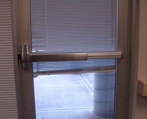
This a well designed push handle door. Just by looking at it you know which side to push on and how it opens. There is no reason for anyone to get confused while using this door.


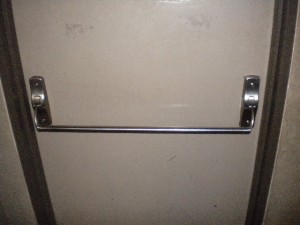
This is a poorly designed push handle. Yes it makes you want to push, yet there is no indication on which side. When I first used this door I pushed on the wrong side.


Example 2: Pull Handles

This is an example of a well designed pull handle. You want to wrap your hand around the handle which makes you want to pull.


Example 3: Poorly designed doors 

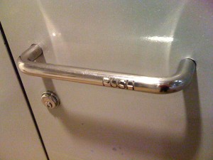
This is a very poorly designed door handle. It is a pull handle that tells you to push. Not only that but the indicitor that tells you to push is difficult to see and read. I can guarantee you that many people have placed their hand over the words ‘push’ and tried to pull the door open.


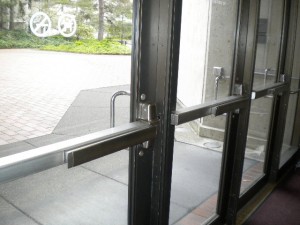
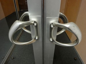
This is another poorly designed door. Both sides have pull handles but we all know that only one side can be pulled. Can you tell which side it is?


The Verdict.

This might be the best door design. You have obvious push and pull handles on each side. There should be no confusion on how this door works.