Tag Archives: Journal Entries

Portland Art Museum

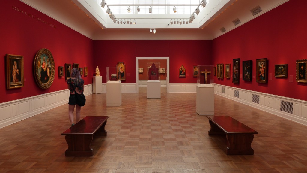
During week 6 I chose to visit the Portland Art Museum. This particular museum drew me in with its exhibit showcasing Carrie Mae Weems, a prolific photographer we had been introduced to in Winter quarter, as well as its focus on unique modern art. I definitely was not disappointed.

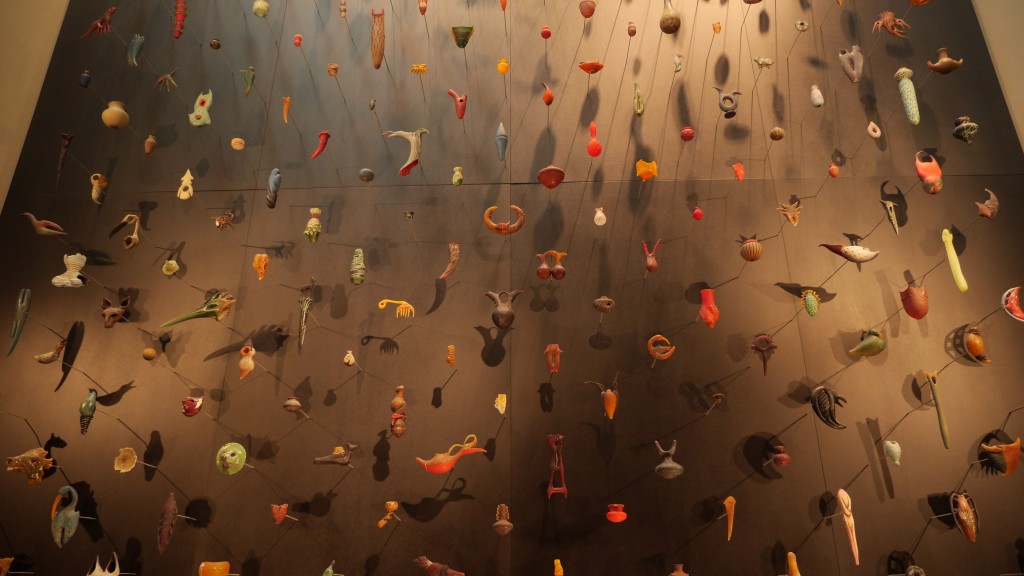
First of all, the building itself was beautiful inside and out. Unassuming from the outside, clean and elegant on the inside. Walking around reminded me of being in the Museu Picasso or the Barcelona Museum of Contemporary Art, both in the same city. Everything was displayed so nicely and basically uniform… it was a treat on the eyes. Even the rooms themselves were pieces of architectural art, I’m sure they had envisioned such when in planning and construction. This place was truly an art gallery, both holding and being art.

I wasn’t completely sure what had happened, but I missed one of the special photography exhibits that was based mainly on landscape photography, I think primarily done by one person. Well, whatever. Instead I will talk about the regular photography exhibit as well as the special one on Carrie Mae Weems. In the normal exhibit there was a lot of really striking images, yet I kept finding myself asking the question that Kitty asked of me a while ago… what makes this fine art? I can sit there an analyze a photograph to no end, comment about the composition, the lighting, the exposure, the color, the focal range, the depth of field, the mise en scene… but who is supposed to know when just looking at them? There were a lot of stark, raw images there, mainly in black and white, that depicted normal life. It seemed like there was an emphasis in part of the exhibit toward capturing families in their domestic spaces. It definitely seemed to follow a similar idea to Eric’s project.

Carrie Mae Weems’ exhibit was laid out so well, I really wish there was a bird’s eye view of the space available, they had a lot of great portraits with funny question/answer cards next to them, a few large projectors displaying her work/people that were close to her work and most notably the Kitchen Table series that was shown to the class last quarter. Such an exquisite series, I love every image to death. I loved them so much I tried to snap a photo then got in trouble :P Fantastic exhibits for photography for sure. Definitely worth going to the Portland museum vs. Seattle just for that alone.

One of the last things I’ll mention is the fact that this place was a labyrinth of stairs, random exhibits and very sparse signs. It made it easy, and fun, to get lost within the museum’s walls. However, it got kind of old when I was trying to find the second special exhibit as well as just know exactly what I was looking at without their rentable iPod guided tour. The rest of the museum was superb, full of beautiful modern art that art my eye every time I turned the corner. It was refreshing to see so many good, creative, original pieces of art.

All in all, a highly recommended museum. Great aesthetics in terms of architecture and display, fairly friendly staff, great exhibits and I definitely found some of my new favorite artwork here.

Living in your Car

Howard, the main character in my film, finds himself in a predicament — he moved down to Olympia after losing his job to start anew, and after a few weeks of no luck he finds himself still living in his car. With no motivation and only a job at ChaCha, he tries to find meaning in his now completely mundane lifestyle to no avail. He’s been sort of forced to live this way, but it could probably be said that if he just put in the time required — he most likely would be able to pull himself out of this deep rut.

I read a lot of articles about living in your car for this project, some of the ones that stuck out to me dealt with people who are simply choosing to live in their cars out of convenience and budget constraints. A Businessweek article in 2012 said that there was an informal estimate that out of all homeless Americans, 59% live in their cars, vans or trucks. A lot of people do it because the simply cannot afford the payments on their houses, some do it almost right off the bat because they see the frugality of living in a motor vehicle. You can even live a pretty posh lifestyle by getting an RV. In the same Businessweek article, however, there was a piece about a Californian woman who had lived in her Toyota Prius for 5 years while working part time and going to school in different cities. My god, that is crazy.

I’d always thought about buying a big van and living in it. It definitely would be more affordable and I would really enjoy being that mobile all the time. I also love decorating spaces, so making a van a nice place to live would be an interesting opportunity to be creative. I actually thought pretty seriously about moving into a motor vehicle instead of an apartment or a house for the summer and came across this awesome wikiHow article that pretty much lays it all out for it. Give it a read, couldn’t hurt to consider some options if things go south/you want to have a little adventure! The links to the Businessweek article and another Shareable article are at the bottom.

Living in Your Car – wikiHow


http://www.businessweek.com/articles/2012-03-02/living-in-your-car-no-longer-just-for-bums

http://www.shareable.net/blog/Is-Living-in-Your-Car-A-Viable-Way-to-Save-Money%3F