Portraits: Up Clothes and Personal

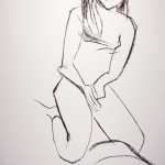
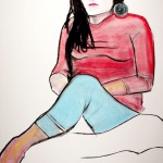
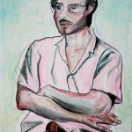
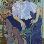
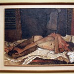
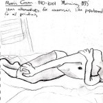
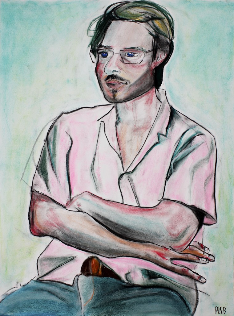
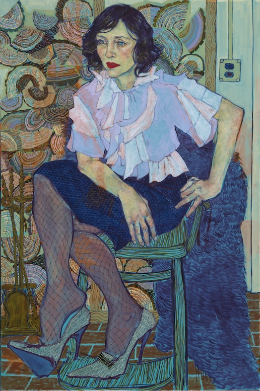
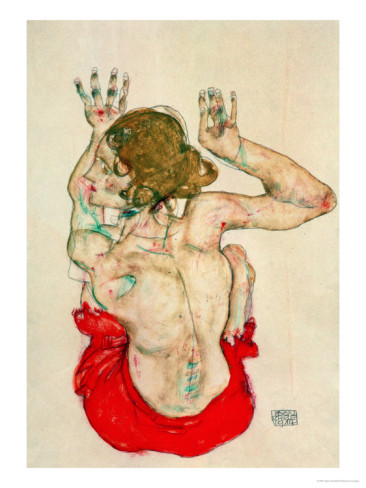
This week’s drawings were a continuation of my usual ritual with figure chalk pastel portraiture- This is basically considered figure drawing, but with more focus on the face and upper body; I call it portraiture because my approach is showing a likeness of the person, their expression and character whereas ‘figure drawing’ typically frames the entire body and is more concerned with accurately interpreting anatomy- although every aspect of shadow and geometry in figure drawing is totally relevant in portraiture.

These drawings were done using a makeshift easel: Giant ply board duct taped to a chair at an angle with paper clipped to ply board, as I sit across in a chair of the same height. Usually Iv found it more fun and challenging to draw figures nude, to capture shadow and curves but drawing people in their clothes can be even more engaging; to dance around the wrinkles and shadows cast by clothing; thin stripes and creases of tight denim, flowing waves of loose fitting cotton. When I draw my friends, they are allowed to wear anything they want so that hopefully the drawing will capture their honest essence. Lately Iv been checking out John Updike’s ‘Still Looking’, a series of essays on early American oil paintings, where looks at 18th century painter John Singlton Copley, who had wealthy patrons commission him to paint their families; their lavish masquerade-like choice of dress and the likelihood of those being their regular attire. They are dressed to impress and Copely’s accuracy of facial and body character is telling of their real attitudes: “If the honest merchants and their plump, long-suffering wives appear uncomfortable in upper-class masquerade, it is because Copley has put enough of their real selves on view to register their discomfort” (Updike 13)

Journey to the SAM/ Looking At You Looking At Me

Last week’s visit to the Seattle Art Museum was enlightening, inspiring and informative to the approach in portraiture that I’m going for. After a day of profuse sketching and wandering, I couldn’t wait to run home and start drawing people. While gazing at some paintings by 20th century Spanish-American artist, Morris Graves, especially “Morning” 1933, my questions on the line between realism and expressionism were answered; getting the right body proportion is key. Pictured bellow are “Morning”, and some of my sketchbook studies (my solution to forgetting to bring a digital camera)

As I’ve had time to contemplate and experiment with portraiture, these past weeks have been all about figuring out correct proportion and skin tone, using myself and friends as quinine pigs. My goal is to get used to adding more and more color to the person, to execute an honest skin color and body proportion that is vibrant and expressive; much like what is shown above: Hope Gangloff’s “Vera”, 2013. Despite the urging of friends and artists for me to start oil painting, I am still going deeper into using chalk pastel as testing grounds for getting skin color down; something that’s important for me to get comfortable with before I graduate on to the medium of oil. In my latest portrait, “The Jamie” I’ve implored the use of some vivid, surreal colors, while also trying to stay true to the shadows I perceive. In terms of expression, I wanted to emulate the sense of natural comfort in his body language, the contemplative look on his face, the cool atmosphere of light cast by the bluish wall in the background. For a full-scale look at my drawings, go to the ‘Images’ tab above

Hope Gangloff “Vera” 2013

Interview with an Art Collector

Here I interviewed George Meyer, an art collector and ex writer for “The Simpons” on ways that the art hanging in his domestic space affects him. For his entire life George has been a lover of all art forms including music and and all things pop culture, and now lives not more than a five minute walk from The Seattle Art Museum, where he often visits with his wife and daughter.

Q and A:

Q. How does having art in your home affect you?

A. The art is a subtle daily reflection of my values. It can be comforting or challenging, depending on my frame of mind. The work also evokes vanished years, especially their joys and struggles.
Q. What sort of moods or feelings do you get from the colors in your domestic space?
A. My art tends toward splashy, vivid colors; the bright hues lift my spirits on crummy Seattle days. When I’m feeling precarious or besieged, the colors can seem jangly and garish… particularly orange for some reason. But usually art feels like a loyal friend. The paintings in my bedroom have a subdued palette… I don’t want them keeping me awake!
Q. When you start collecting art and why?
A. I think the first original piece I bought was at Comic-Con in San Diego… maybe around 1991. It was a Dan Clowes page from “Eightball.” I didn’t mean to become a collector, I just admired Dan’s work and finally could afford something. I later branched out to Adrian Tomine, Dennis Worden, Ivan Brunetti, Robert Williams, the Clayton Bros., Tara McPherson, Lari Pittman, and others.
(Shown bellow are some pieces from George Meyer’s collection)
I’m usually drawn to idiosyncratic, singular artists. They often become friends — at least Christmas card friends — and their faces swim into my mind when I look at their creations.
Part of the collecting impulse is a desire to throw in my lot with brave souls who are taking risks and exposing their deepest yearnings.

Moving into Figures

Egon Schiele "Female Nude Seated on Red Drapery" 1914I am so appreciative of the feedback from week four, and for the encouragement to make more color portraits- this has been a daunting task for me in the past, something I’m intrigued by and also scared of messing up. In doing this, I feel the pressure to live up to my mind’s expectation of the final result, and do my best despite being attached to an outcome. Basically, I’m trying not to make them look like a Sea-World Caricature! In this week’s portrait, “Sarah Readin'” I drew influence from Austrian artist, Egon Schiele, for his modest use of color, and using color opposites drawn side by side, to give off a certain ‘3D Glasses’ effect; Seen here in Female Nude Seated on Red Drapery, Back View (1914)