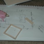
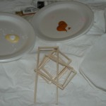
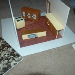
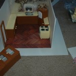
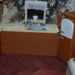
Kitchen Construction Photos
Final Week: Kitchen Construction
This was my busiest week of the quarter so far, because of the schedule I had created for myself I needed to leave time at the end of the quarter to take and develop my black and white photographs. This meant that I needed to complete my final model in one week. This weeks focus was on design psychology and the kitchen. As I began to sketch my floor layout, I kept in mind all the things my book had brought to my attention. To successfully employ design psychology one has to think back to their previous domestic spaces, highlight the things that worked for you and the things that didn’t.
Everyone’s design psychology will differ because everyone’s domestic space history differs, but the main concept is to find the things that pleased you about each place and mesh them together. I took myself back to all the different kitchens in my life, kitchens my parents designed, kitchens I grew up in, as well as, the kitchen in my first apartment. I made sure to notice the things that worked for me as well as the things that I didn’t like. I remembered how much I loved the window above the sink in my father’s kitchen, It was always nice to look out at the back yard as I was forced to wash the dishes and the fact that his refrigerator was built into the wall meant I never had to pull it out and clean behind it. I remembered that the kitchen my mother had designed in our third home had so much storage that our counters were never cluttered with appliances and always had a clean look about them. I also remembered that in my first apartment kitchen I had loved the fact that I had a nice deep sink, this came in handy because there was no dish washer. I also remembered the things I hated, In my apartment there was a terrible island that seemed to always get in the way when there was more than one person in the kitchen, I knew for my model I would want a kitchen that was open and airy.
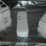
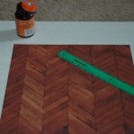
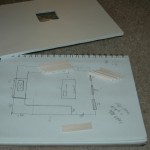
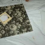
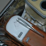
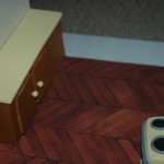
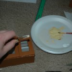
Finally it was time to draw up my layout and get to designing. I wanted to have wood floors in my kitchen because I think it gives it such a clean and natural feel. I then decided on colors, this I struggled with for quite some time, the wood floor I found was dark so I wanted to compliment that with a light color while also keeping the cupboards a natural color. I finally decided on yellow and brown. I found some scrapbook paper that complimented these colors well to use as wall paper. It was now time to make the appliances, I created the oven and refrigerator out of clay, then cooked it in the oven to harden it and painted it to the right colors. I was going with a vintage feel for this model so I researched on the internet as I created these pieces. I then cut cardboard and basswood to make the structure for the refrigerator. I created the sink from clay as well, making sure to fit it into the wood I would use as counters so it would dip down into the counter like a regular sink would do.
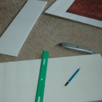
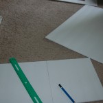
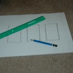
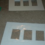
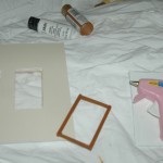
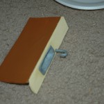
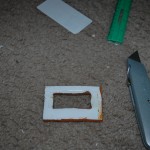
One thing that I did differently in this model was use more foam board than usual. I need to create cupboards and foam board is easier to cut than wood and it hold paint just as well. I measured, cut, glued and painted the bases for the cupboard and then topped them with basswood that I painted yellow for the counter tops.To create the hanging cupboard I used foam bored, created the box, measured, cut and glued a shelf then when I created the doors I decided that I wanted them to have glass windows. I cut out the window from the cupboard door and covered it with a tougher clear plastic bag giving the impression of a glass pane and then added a handle.
It was important to me to add the little details that really give it a kitchen feel. I added a small pot to the window sill over the sink and a to do list to the refrigerator. I found a miniature apron and pot holders that I placed around the kitchen as if someone was in the middle of cooking. After re-reading the article I submitted for seminar last week I was reminded of my inspiration for these projects, The Thorne Rooms, and how her detailed accents (the open book, or pulled out chair) really gave the models a feeling of being lived in and allowed you to put yourself in them. Overall I have enjoyed this project immensely and feel that I achieved what I was trying to achieve. My models are by no means on the level of an art museum piece but I have put my heart and soul into them and are proud to call them “The Bones of the Home.”

