The Mac, iPod, iPhone, and now iPad have transformed the way we do just about everything since their release. 1984 was only the start of Apple Computer Inc. Despite the years Apple was close to failing, they didn’t give up on the road to reaching success. As Apple developed and improved, the company came up with the idea of creating a cyber café where one was able to freely access the internet in order to use and/or test-drive their devices. Apple has always been unique in the design and performance of their devices, and their stores are no exception. Apple wanted to create the best shopping experience by providing a place to get answers, get helped, and find the right product.
The idea of an Apple store was, for many economists, a crazy idea that was bound to fail within years of its opening. On May 19, 2001, the first two stores opened their doors at 10:00am. This successful opening was only the start of the 400+ stores that are currently worldwide. Apple stores are not only home to the various devices, but their welcoming environment and unique service has made them a place for many to come and make confident purchases. But, is it the employees and devices that attract so many people worldwide to these stores? Apple does have a large, strong, and consistent base of followers; but thanks to the unique architecture, people have the opportunity to be introduced and welcomed to the Apple family as they purchase their highly desired devices.
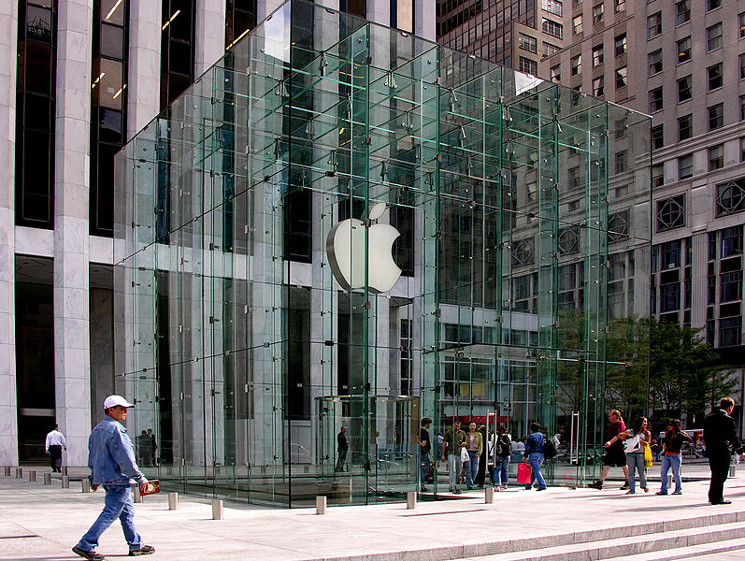
Apple stores are not only unique, but artistic as well. Most commercial architecture is under-detailed, under-budgeted, ugly, and often an eyesore on America’s landscape. When one thinks of an Apple store, they think of it being elegant, and technologically advanced. The use of glass, aluminum, and wood also makes them environmentally friendly stores. Through Apple’s visual standards all stores have similar, if not the same, layouts and architecture. They are distinctively and commonly seen as a big silver cube with the Apple logo centered towards the top. However, there are a few stores that go beyond such standards, transforming it into a piece of art; these stores are often considered tourist attractions.

Apple makes stores that are beautiful to look at, and highly seductive. It doesn’t matter where one is from; the Apple logo is always recognized and their stores attract many customers who are simply passing by. Despite what many economists predicted, the opening of a new Apple store is always successful. These large events attract many people, even some that travel to different countries just to be the first ones through the doors. Unlike Apple, competitors try to achieve success by offering tickets to concerts or any other gifts as incentive to get people to come to their opening events. Often this doesn’t come close to what Apple has built. The experience offered by Apple stores is not what you generally get at other retail stores. Rather, it is a place for people to come admire beautiful architecture, and have a chance to congregate as a community that shares a love for the products Apple offers.


Comments are closed.