May 27

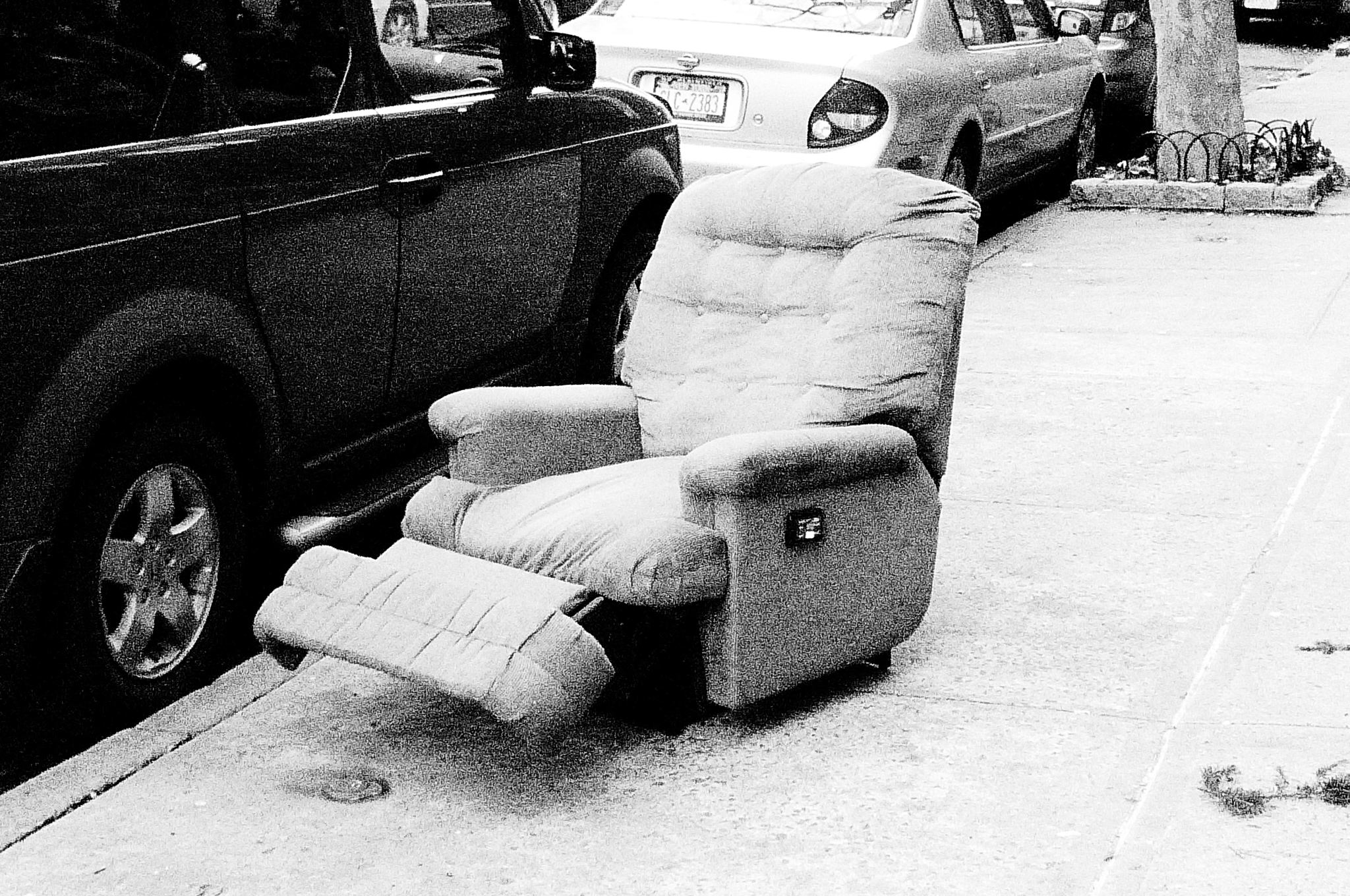
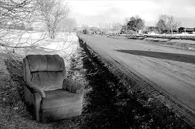
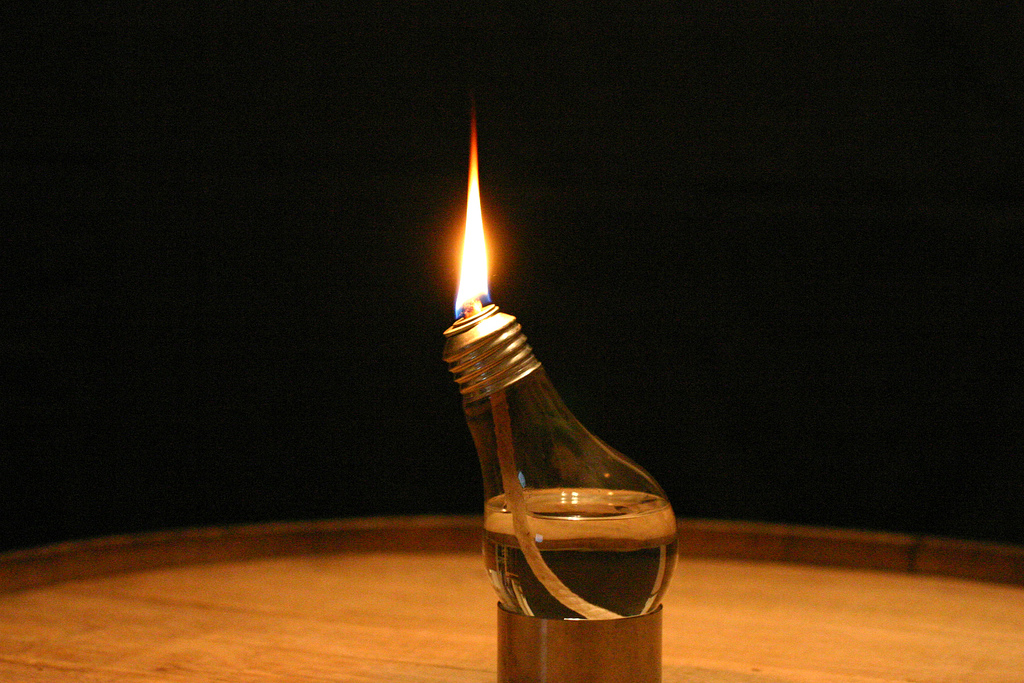
There is only one use for a lamp. It lights the room up. Everything I have designed thus far needs to follow certain rules. The couch has to be large and comfortable. The reclining chair has to be able to recline. The coffee table has to have a flat surface to place things on. These objects have a certain look to them. If you really wanted to change how they are you would need to completely revolutionize it’s design. The lamp however, doesn’t have this. A lamp can look like anything, it can be anything, as long as it produces light you can call it a lamp. Lamps can be made out of anything. It is something that usually leans towards a more aesthetic approach when you are designing it.

People have been using sources of light ever since we discovered fire. Since humans cannot see very well at night we have been using light as a way to protect ourselves and go places that we never would have dreamed of. Being able to manipulate light has changed how humans live. We can stay up well past nightfall and as a result we have more time to learn and discover. The sun is no longer a source of life but a huge lamp.

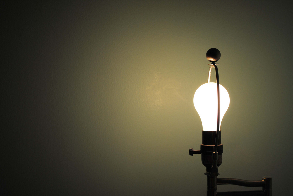
So for this design I am actually going to focus on aesthetics. I said I would do this on the coffee table but I soon realized that it would make more sense for the coffee table, reclining chair, and couch to all match. I want this lamp to match as well but I want to make it stand out. The whole purpose of this project was to create an ergonomic furniture set. Not all of the furniture pieces are completely ergonomic when they are by themselves but when they are put together they make an ergonomic living room that utilizes the function of the living room as well as the space.


May 17

The coffee table is a standard household item that is constantly over looked. We don’t quite realize how important of an object it is and how versatile it can be. It is not only used for beverages, like the name entails, it can be used as a foot rest, an object to gather around for conversation or even a meal. The coffee table is an important and necessary item to have in every living room. It helps to create a flow of traffic through the furniture.


Standard coffee tables are basically a piece of wood on top of four legs but it has the potential to be so much more than that. It can be a storage device or even a conversation piece. For this weeks design I am going to focus on making a coffee table that looks interesting and is versatile. On my previous designs I have been focusing mostly on function and not form. But since the coffee table is such a basic object I feel as though this is a good time to try to work on the aesthetic part of design as well.

May 10

Although not an extremely common household item the reclining chair has been around for many years. One of the first reclining chairs was created by Edward K. Knabush and Edwin J. Shoemaker, two Americans, who then patented the wooden recliner in 1928. This patent was the start of the founding of the company La-Z-Boy.

A reclining chair is characterized by the ability to recline with a folding foot rest and tilting back. One problem that the recliner faces is the fact that once you recline you are facing the ceiling. Most recliners are placed in the living room where a television is present. If you recline in the chair then you are unable to watch. You can’t even really read once you are reclined. My goal in this design is to create a reclining chair where you can lean back while still facing forward.

Reclining chairs always look comfortable. ALWAYS. This is because there always seems to be an excessive amount of padding. Many times I have looked at a reclining chair thinking it will be comfortable only to realize, upon sitting, that is it not. This is a design aesthetic that is important to notice. If I want to create a comfortable chair it not only has to be comfortable but it has to look comfortable. It has to make someone want to sit in it.

Apr 29

The couch is a standard household item. We use it for so many different things; sitting, sleeping, relaxing, watching television, reading a book, talking to people, eating dinner. A lot of thought goes into purchasing a new couch and when we do we hope it lasts forever. The couch can provide people with many different memories and feelings. Couches can say a lot about someone’s personality. There are so many different styles of couches. They can range from sleek modernist couches to old lumpy futons.

When choosing a couch, the primary function that a person is looking for is comfort. Can I sit on this couch for a long period of time and without getting uncomfortable? If the answer is yes then you have chosen the right couch. The dimensions of a couch and the material it is made out of can affect the comfort level. It needs to be long enough that you can lay down and wide enough that you don’t feel like you are sliding off. Wooden armrests look nice but aren’t ideal for resting your head on (a very common practice). As I have stated many times before, practicality should over ride aesthetics. A couch is meant to epitomize comfort. It is an object that you sit down on after a long day.


In the end there isn’t  a one size fits all couch design. In fact, there isn’t a one size fits all anything. However, this week I am going to work on creating my own couch design. Couches may seem very simple and this is true, but there are many things to consider when designing a couch. How large should it be? How many people should it hold? What type of functions should it have? I have already started listing what I want this couch to have and I am going to begin designing it soon.


Apr 28

Over the course of the weekend I participated in a usability study for T-Mobile. Although I am not at liberty to discuss the details of the study I can tell you what I learned from it. Usability testing is something that companies will do in order to see what parts of a design work well and what parts don’t. This method of testing is important. However, many companies don’t do it. In fact, T-Mobile doesn’t do it very much itself. It doesn’t even have a usability department, it has to hire outside contractors to get their testing done. The reason most companies don’t do usability testing is because it takes a while to do. You have to find people, schedule appointments and conduct the research. Once research is conducted it takes time to find correlations between information provided. Most of the research done is qualitative not quantitative.  So this can slow down the process as well.


Usability testing is a very important method that should be utilized more often. Although most designers are competent in their method of design it is still important to have your products put through tests to make sure it’s not too difficult to use. This is just another method that designers should consider. If you are not sure how to design for the user, have your products tested. Usability testing is also a good way to learn new things about how people interact with their surroundings. The information that you gather from one test can be used to help design something else. It helps make designing easier and products less complicated for the user.


Apr 18

Doors. We use them everyday. They are not a very complex tool yet for some reason we can struggle with them. Whenever you struggle to figure out how a door works you typically blame yourself. “This object is so simple I must be an idiot to not know how to use it”. However, doors have amazing cues that tell us how to use them. When these cues are absent we become confused.

Example 1: Push handles

This a well designed push handle door. Just by looking at it you know which side to push on and how it opens. There is no reason for anyone to get confused while using this door.


This is a poorly designed push handle. Yes it makes you want to push, yet there is no indication on which side. When I first used this door I pushed on the wrong side.


Example 2: Pull Handles

This is an example of a well designed pull handle. You want to wrap your hand around the handle which makes you want to pull.


Example 3: Poorly designed doors 

This is a very poorly designed door handle. It is a pull handle that tells you to push. Not only that but the indicitor that tells you to push is difficult to see and read. I can guarantee you that many people have placed their hand over the words ‘push’ and tried to pull the door open.


This is another poorly designed door. Both sides have pull handles but we all know that only one side can be pulled. Can you tell which side it is?


The Verdict.

This might be the best door design. You have obvious push and pull handles on each side. There should be no confusion on how this door works.


Apr 16

In the book The Design of Everyday Things by Donald A. Norman, one idea that is stressed is how users blame themselves for bad design. We assume that mass produced products are designed properly because we trust companies to put their products through rigorous tests. This truth is that many products are released without any usability testing at all. Companies assume that designers know what they are doing if the product looks nice. However, design isn’t all about aesthetics  If you have trouble using an item don’t blame yourself, blame the design. There is no reason for you to feel stupid because a designer focused more on making an item look nice then making it functional. Function and form can work together to make a product that is easy to use and nice to look at.

Typically when products have too many functions it can become confusing and overwhelming trying to figure out how they all work. So why don’t we have this problem when it comes to the dashboards on cars? Dashboards have tons of buttons that do many different things but somehow we are able to hit the right button even while driving. This is because most of the time car dashboards are designed well. It is important that people do not become confused when driving since it can cause such large risks. If someone can’t figure out how to turn on their defrost and the car windshield is fogging up problems can arise.  It is possible to make an object that may seem confusing not confusing at all.

Take this picture of controls for powered adjustable car seats for example. The buttons are in the shape of a seat so just by looking at it you can see how one button would move the head rest while another would move the seat itself. This button layout is an excellent example of natural mapping, affordances and constraints.

So next time you are buying a new product take design into account. Can you figure out how it works by just looking at? Will I make mistakes because the mapping isn’t natural? If a company makes a new product that is difficult to use, by buying that product you are basically telling the company that the design is fine. This is why objects that are poorly designed seem to last for years. Take the CD for example. CD’s are very sensitive and need a case in order to keep it safe, even the case itself is poorly designed. Where just a few years back we had floppy disks that were very well designed. There was only one way to put it in and the part that was sensitive to touch was protected by a plastic covering that was pulled back when inserted into a computer. Yet floppy disks left as fast as they came and it seems as though CD are around to stay.

Don’t assume designers know everything. The objects they build are for you, the user, therefore you should know how to use them without any difficulty. If you fail in understanding how an object works, especially if it appears simple, than the designer failed, not you.


Apr 14

So this week I finished the book The Design of Everyday Things by Donald A. Norman.

I learned a lot about basic design in this book. Some of the highlights include;

  • Natural Mapping:  This is a very important part of design. Natural mapping has to do with how the layout of the controls are arranged when working with an object that requires controls. If an object has good natural mapping than a person should be able to use it by just looking at it. An example of this is below with the stove top.
  • Constraints and Affordances: This is has to do with how many things an object can do. For example, when you look at a coffee mug handle there are very few ways to hold it. It is designed in such a way that you want to hold it with one hand because that is all that is physically possible. When an object contains affordances it makes it easier for people to use because there are less ways for them to mess up.
  • Feedback and Visibility: This is how an object tells a person that what they just manipulated did something. So when you turn the tv on and you can see the little light in the corner turn from red to green. This means that you pressing the button did something and everything is running smoothly. Computers are notorious for having very little feedback. This is because so much is happening behind the scenes it it very difficult to show users what is happening. So when you click on something and nothing happens, the little progress wheel doesn’t pop up, you automatically assume that you failed in clicking. It is important to have feedback or else users assume that either they are doing something wrong or that the item is broken.

Bad Design

Good Design

The picture above shows how a design with natural mapping should look. You know how to use the stove by just looking at it.

Apr 08

Ergonomics is method of design that focuses on creating objects based on the physical measure of the human body and the cognitive processes of people. It’s main priority is to make objects more comfortable to use but also more intuitive. Ergonomics is closely related to Human Factor Psychology, in fact, these names are interchangeable.

Examples of ergonomic designs:


Ergonomic Design