For the past month I’ve been working on designing a logo for Student Village. My first career choice was in graphic design in 2005 and after a few years of art school, I decided to pursue different endeavors. I absolutely love design, but I’ve always struggled with translating the hand-drawn to a computer. Interestingly enough, this was THE primary topic last year in the program Making to Ornament (feel free to peruse my blog in the link). Luckily for me, the concept behind the logo was playful, student-centric, earthy & organic design.
With any successful logo, you have to find a simple, readable image or icon that represents the whole idea. Some key words that I used in my initial brainstorm: growth, all day (i.e. boarding house), fun, bamboo, Wave House. The first designs included the Wave House as a primary icon, since it is our space of gathering in the middle of the Village and the place we eat meals, play games, and hang out.
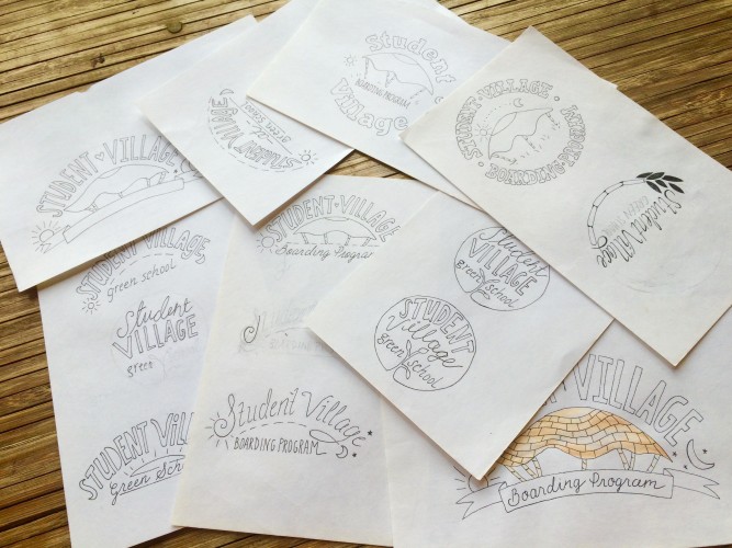
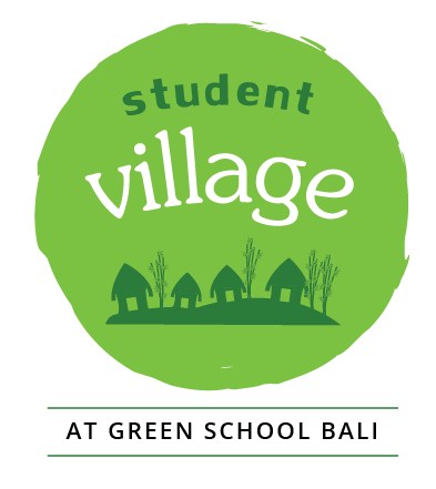
Then we started talking about what words to actually put in the logo. Should it be called a boarding program? Or does Student Village imply this? Should we put Green School in it, for the purpose of piggybacking on their well-established marketing? We went back and forth on these ideas and then picked a few of our favorites. These drawings were among them:
So I started playing around with this logo in Illustrator. I haven’t really used the program a lot, so it was very challenging. I had Carol to help with my endless questions! However, I found that the hand-drawn quality looked really weird when you took it into the program. I picked out a few fonts that went along with the general look that I was going for and came up with these:
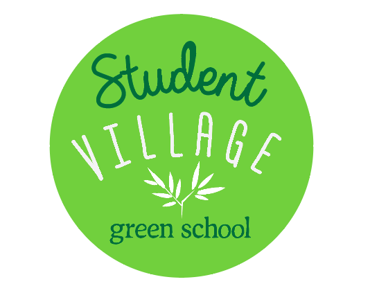
I still wasn’t satisfied, but that feeling is all part of the process. We brought these to Irma, Green School’s Communications Director and her feedback was that there were too many words in the logo. Her suggestion was that it looked something like this:
Not too bad! At this point, I had to take some space away from the design. I was hearing lots of different opinions about whether or not to include “Boarding Program” in the logo, and I couldn’t decide for myself. During this time, Irma came to visit Carol and I at the Village and talk about the progress of the Student Village website. We were sitting at Carol’s desk and Irma caught eye to all of the initial drawings that I had done for the logo. She immediately pointed to one of the first ones that I had done and said she really liked it! I laughed and said I would work on that one.
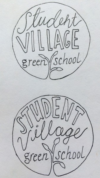
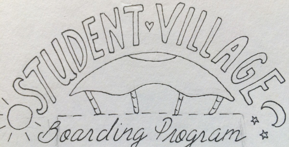
1) Initial Sketch:
2) Developed design using drafting techniques (aka spacing, measuring, erasing):
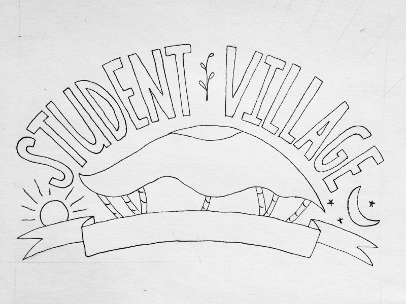
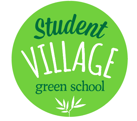
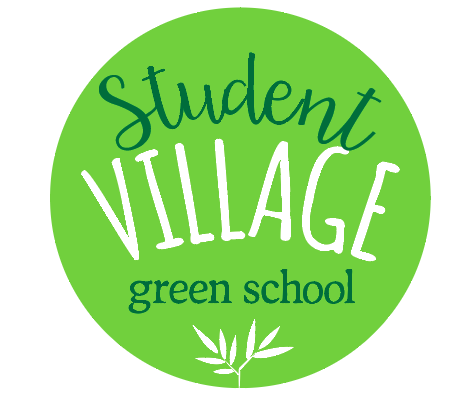
3) The final product:
![]()
note: the colors changed quite a bit when I converted it to a jpeg from an .ID file. I think it would be best if I had selected colors that were web-friendly.
So…This wast he first logo that I’ve created, so I put a lot of thought and effort into making something that I feel fits the Boarding Program! We will be using this logo on the site (which will be done soon!), tote bags, stickers, and t-shirts. Woohoo!
Be First to Comment