Adobe Photoshop is a terrific tool for enhancing images. Whether you’re editing an old, sun-bleached photo from the 70’s or making snow day pictures look less blue, Photoshop has a few simple and easy tools to help. Unfortunately some photos are too low of quality to begin with and can’t be helped as much as we’d like. For example, some images are either too dark or too light, and there isn’t any detail to be enhanced; this tutorial might not help with these types of photos. Here are a few basic tools and tricks, though, to help you make your pictures all that they can be!
Step One: Open your image in Photoshop
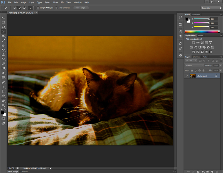
Photoshop CS6 is installed on all of the Apple and Windows machines in the Academic Computing Center. On a Mac, it is located both on the dock at the bottom of the screen and in the Applications folder. On a PC, it is located in the Start menu under “All Programs” > “Graphics Tools.”
Once the application is open, click the “Open Document…” option on the startup menu, or select “Open…” on the “File” menu at the top of the screen. Use the “Open…” screen to locate and open your file.
Step Two: See what needs to be done
Even if you’ve never taken an art or photography class, you should still be able to see what needs to be fixed with your image. Does it look tinted with a dominant color? Is your image washed out or too dark? Take a good, hard look at your image and deduce what you’d like to do with it.
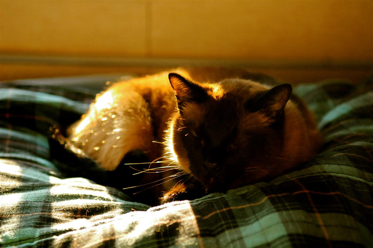
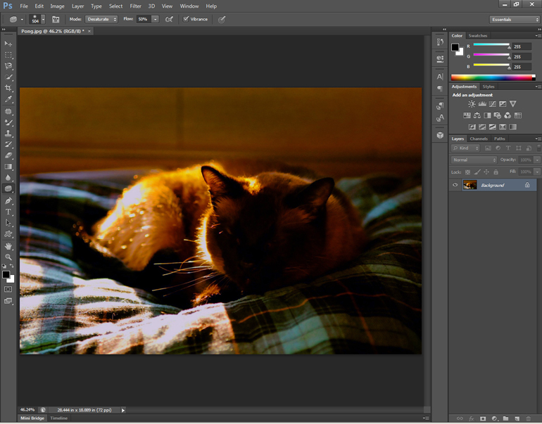
I will be using this picture of my cat. As you can see, it’s very orange. What I plan on doing is giving this just a little more contrast, fixing the color balance, and taking out a lot of that overwhelming orange without removing the warm light hitting Pong the cat.
Step Three: Brightness and Contrast
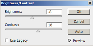 One of the most basic improvements is to tweak your image’s brightness and contrast. This does just what it sounds like, changing the overall lightness or darkness of the image with “Brightness” and making your highlights and lowlights more distinguished and contrasting with “Contrast.” While it sounds simple, these two features can make an image look more vibrant and powerful, even in small increments.
“Brightness / Contrast” can be found in the “Image” menu at the top of the screen under “Adjustments.” Each feature gets a slider bar. Pulling the “Brightness” bar to the left makes it darker, while going to the right will give a lighter average. Similarly, pulling “Contrast” to the left gives it less contrast, more to the right.
With each of these, be careful not to go too far. Too much contrast loses image detail, as does too little contrast. Too bright of an image, just as with too dark of an image, will give it the wrong feeling, make your colors look off, and lose a lot of image detail.
My image looks slightly washed out, so I gave it a little more contrast to add depth and dimension to it. I also darkened it just slightly to play off the sunlight.
Step Four: Hue and Saturation
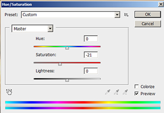 Hue and Saturation are often overlooked in basic image correction. If overdone, it will make your image look unrealistic and strange, but a little goes a long way to make colors pop and become more vibrant, making an average picture look lifelike and rich.
“Hue/Saturation” is located in the “Image” menu at the top of the screen under “Adjustments.” Normally you won’t have to mess with Hue. Hue changes the basic color scheme of the image. Moving that slider bar could make my primarily orange and green image blue and purple. If that’s what you’re looking to do, Hue can be a great way to make an image more abstract with just one setting. Saturation changes how much color is used in your image. Pull the slider bar all the way to the left and your image will be transformed into black and white (a.k.a. a pure lack of color). Pull the slider bar to the right and your image’s colors will be amplified, usually far more than you want.
My image is too orange, and the orange bleeds out a little into the rest of the frame. By pulling the saturation slider to the left slightly, I can make that glaring sunlight more subtle without losing the warm feeling of sunlight.
Step Five: Color Balance
Color balance does exactly what it sounds like: it balances the colors in your image. This is perfect for pictures that are too blue-heavy, too warm feeling, etc.
“Color balance” can be found in the “Image” menu at the top of the screen under “Adjustments.” Three slider bars will appear with different color names on each end. To correct your image, slide the bars towards the colors you want more of.
My image is too warm and orange-heavy, so I’ll be adding Cyan, a little Green, and some Blue to counter some of that.
This is just the tip of the iceberg when it comes to Photoshop. If you’re interesting in learning more about the features and tools Photoshop has to offer, check out Lynda.com. To learn more about logging in to Lynda, visit Lynda.com.
thanks 🙂 very usefull photoshop tutorial