Web-available sources:
[ to be updated ]
Web-unavailable sources:
excerpts posted herein are reproduced according to fair use law.
On use of / response to color:
“It is often said that warm colors (red, yellow, orange) come forward and produce a sense of excitement, whereas cool colors (blue, green) recede and have a calming effect, but experiments have proved inconclusive; the response to color — despite cliches about seeing red or feeling blue — is highly personal, highly cultural, highly varied. […] Note that much of a color’s appearance depends on context. Juxtaposed against green, red will appear redder than if juxtaposed against orange.”
Barnet, Sylvan. A Short Guide to Writing about Art. Upper Saddle River, NJ: Pearson, 2008. 67. Print.
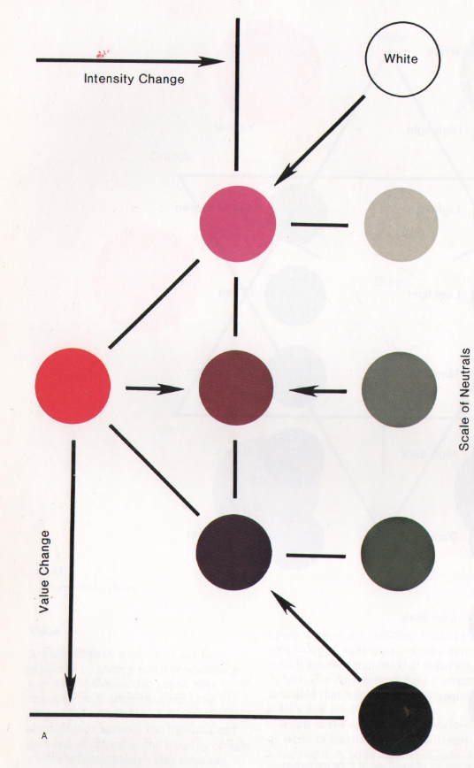
On the effects of different forms of altering saturation and intensity:
“There are four ways to change the intensity of colors when mixing color (fig. 7.8A). Three of these involve adding to the hue pigment a neutral (black, white, or gray). As white is added, the tone becomes lighter in value, but it also loses its intensity. In the same way, when black is added to a hue, the intensity diminishes as the value darkens. We cannot change value without changing intensity, although these two properties are not the same. The third method of changing intensity involves mixing the hue pigment with a neutral gray of the same value. The resulting mixture is a variation in intensity without a change in value. The color becomes less bright as more gray is added but it will not become lighter or darker in tone.
The fourth way to change the intensity of any hue is by adding the complementary hue. Mixing two hues that occur exactly opposite each other on the color wheel, such as red and green, results in a neutral gray. This is because the complementary colors represent an equal balance of the three primaries. The dominating hue in the mixture of two complementary colors gives its specific character to the resulting tone. Consequently, this tone, instead of being a pure gray, is a greyed or neutralized form of the color used in the larger amount. When hues are neutralized by mixing complements, the resulting colors have a certain liveliness of character not present when they are neutralized with a gray pigment. This interesting character is enhanced when the complementary tones are not actually mixed but placed together in little dots of broken color. The mixture then takes place in the visual perception of the observer.”
Ocvirk, Otto G. Art Fundamentals: Theory and Practice. Dubuque, IA: Wm. C. Brown, 1990. 125-27. Print.